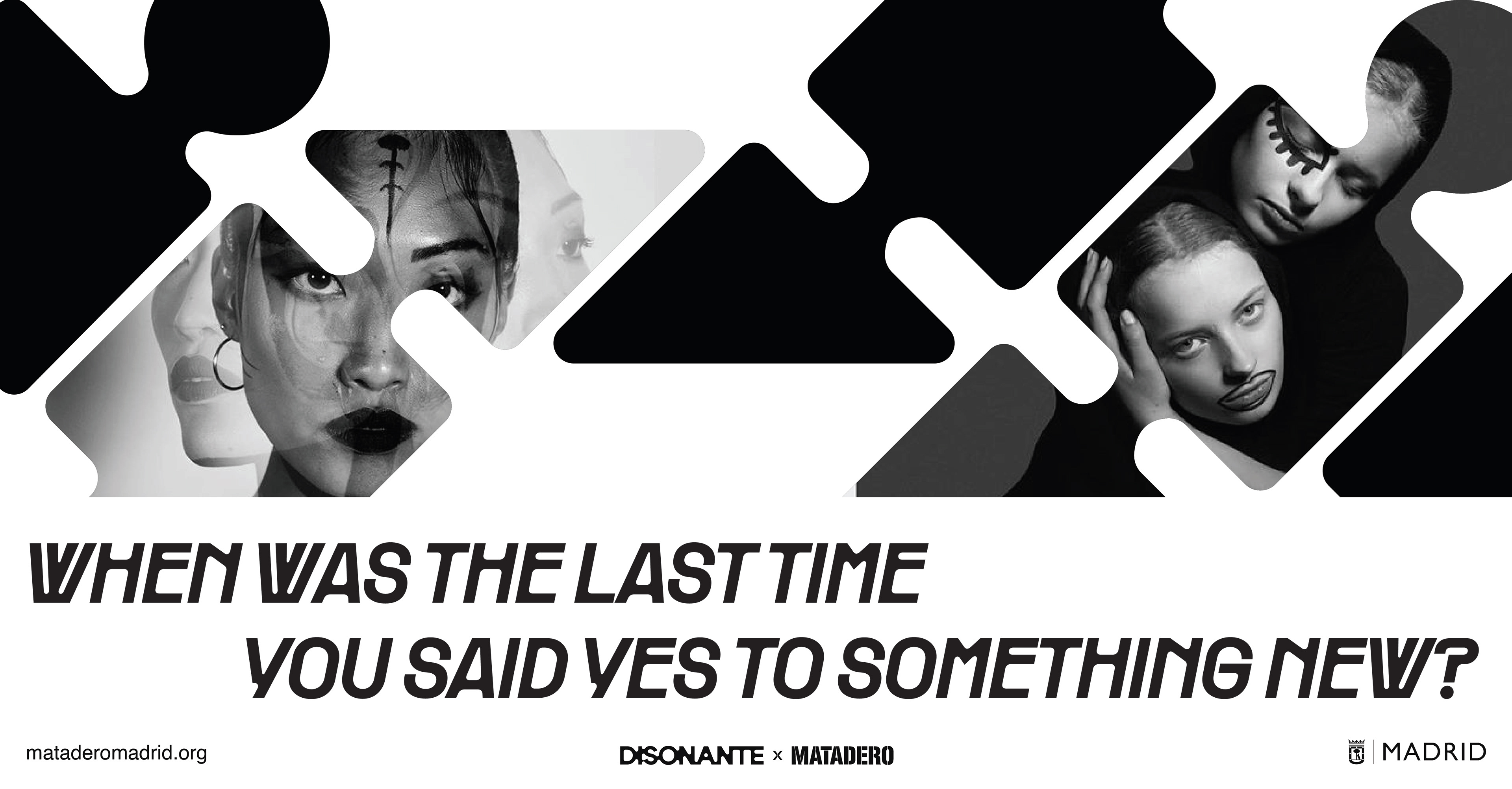
Disonante is the conceptual brand identity for Nave 10 at Matadero Madrid, a multidisciplinary space dedicated to live music and cultural events. The project explores how a fluid, dynamic visual system can capture the raw energy, rhythm, and experimental spirit of contemporary music.
Challenge: Design a distinctive identity that reactivates the venue and attracts new audiences. It had to be instantly recognizable, deeply expressive, strategically diverse to represent all kinds of music genres, and seamlessly adaptable across digital, print, and environmental applications.
Results and Impact:
35% increase in engagement among new audiences.
100% outdoor placements and digital touchpoints.
45+ diverse cultural happenings per season
Client: Matadero-Madrid
Deliverables:
- Complete brand identity system
- Logo and modular visual language
- Graphic patterns and supporting visual assets
- Brand guidelines
- Event posters and promotional graphics
- Social media assets
- Digital and print applications
- Logo and modular visual language
- Graphic patterns and supporting visual assets
- Brand guidelines
- Event posters and promotional graphics
- Social media assets
- Digital and print applications
Year: 2025
Role:
• Brand Strategy • Visual Identity • Art Direction • Graphic Design • Design Systems • Brand Guidelines
Motion identity intro
Disonante: The Shape of Sound
Disonante isn’t just a sound space - it’s a statement. Its visual identity springs from the exact same principles that guide contemporary music: experimentation, the breaking of patterns, and the hunger for new forms of expression. Every graphic element is an extension of sound -geometric yet fluid, structured yet free, symmetrical yet endlessly shifting.
This framework lays down the foundation that gives the brand its coherence and punch to keep the core pulse of Disonante alive across every single application.
The Logo & The Stretched Typography
Forget static type -the Disonante logotype is alive. Letters stretch, pull, and meld together as if caught in a magnetic force field, behaving less like traditional glyphs and more like a pulsing waveform. This liquid, interconnected typography sets the ultimate tone, perfectly mirroring how sounds collide, distort, and bleed into each other in an experimental music space.
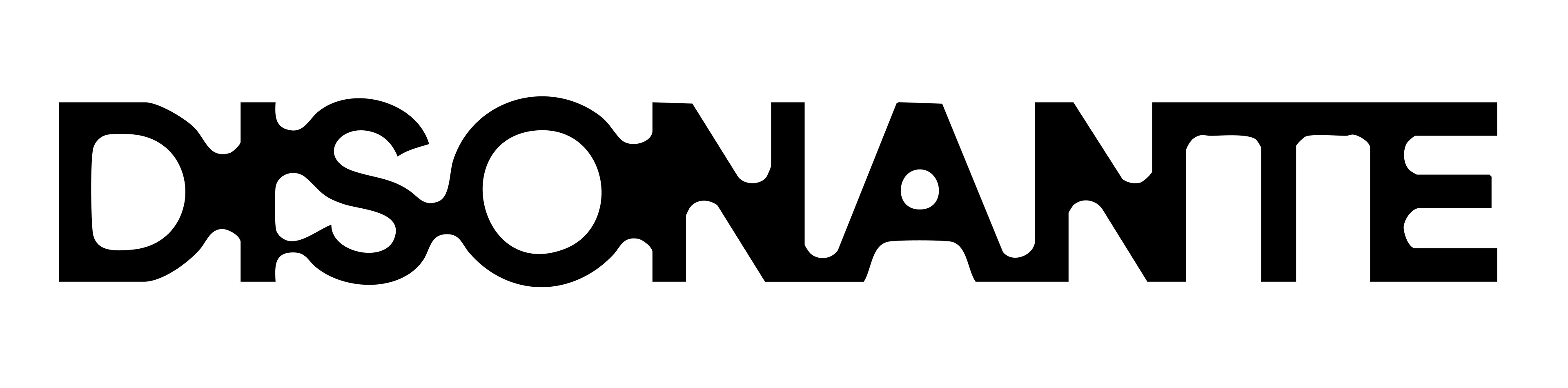
Core logo artwork
Design Concept & The Visual System
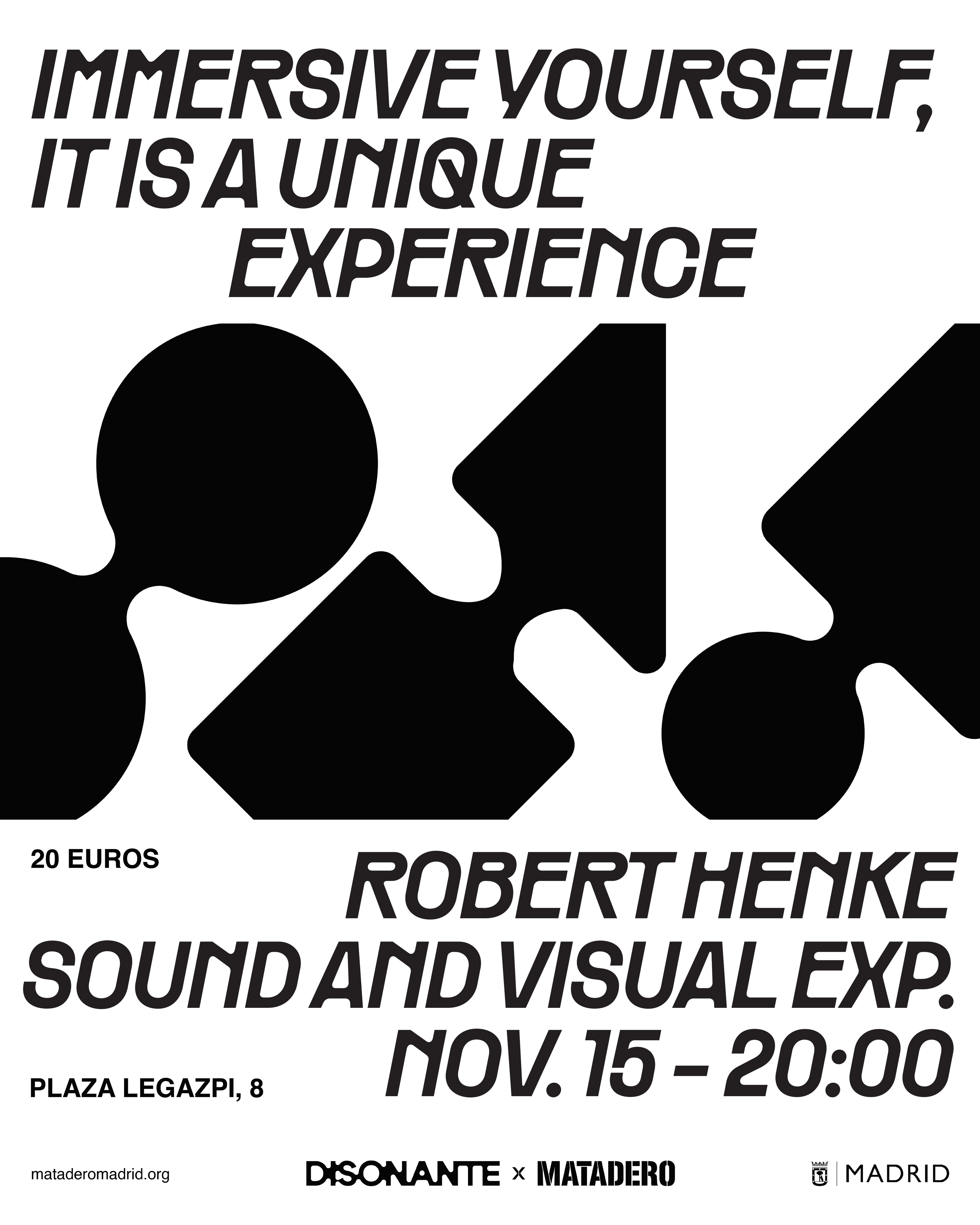
That liquid, pulsing energy doesn't stop at the typography -it bleeds directly into a system of interlocking geometric shapes that drive every poster and digital touchpoint.
By fusing and entangling these shapes, the brand speaks a modular language that’s instantly iconic and endlessly vibrating with life.
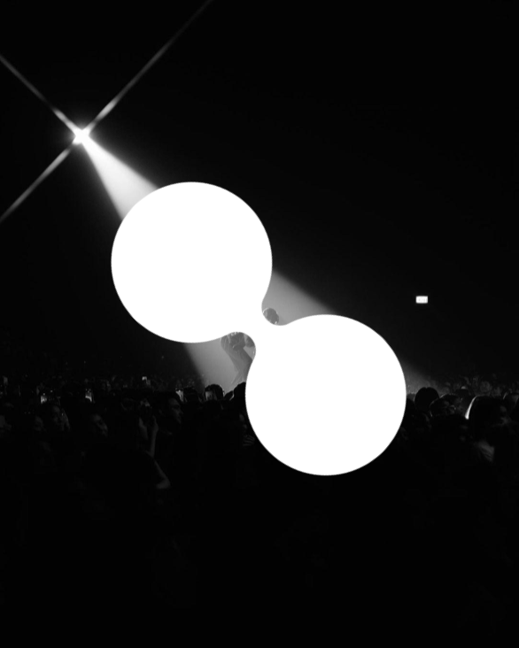
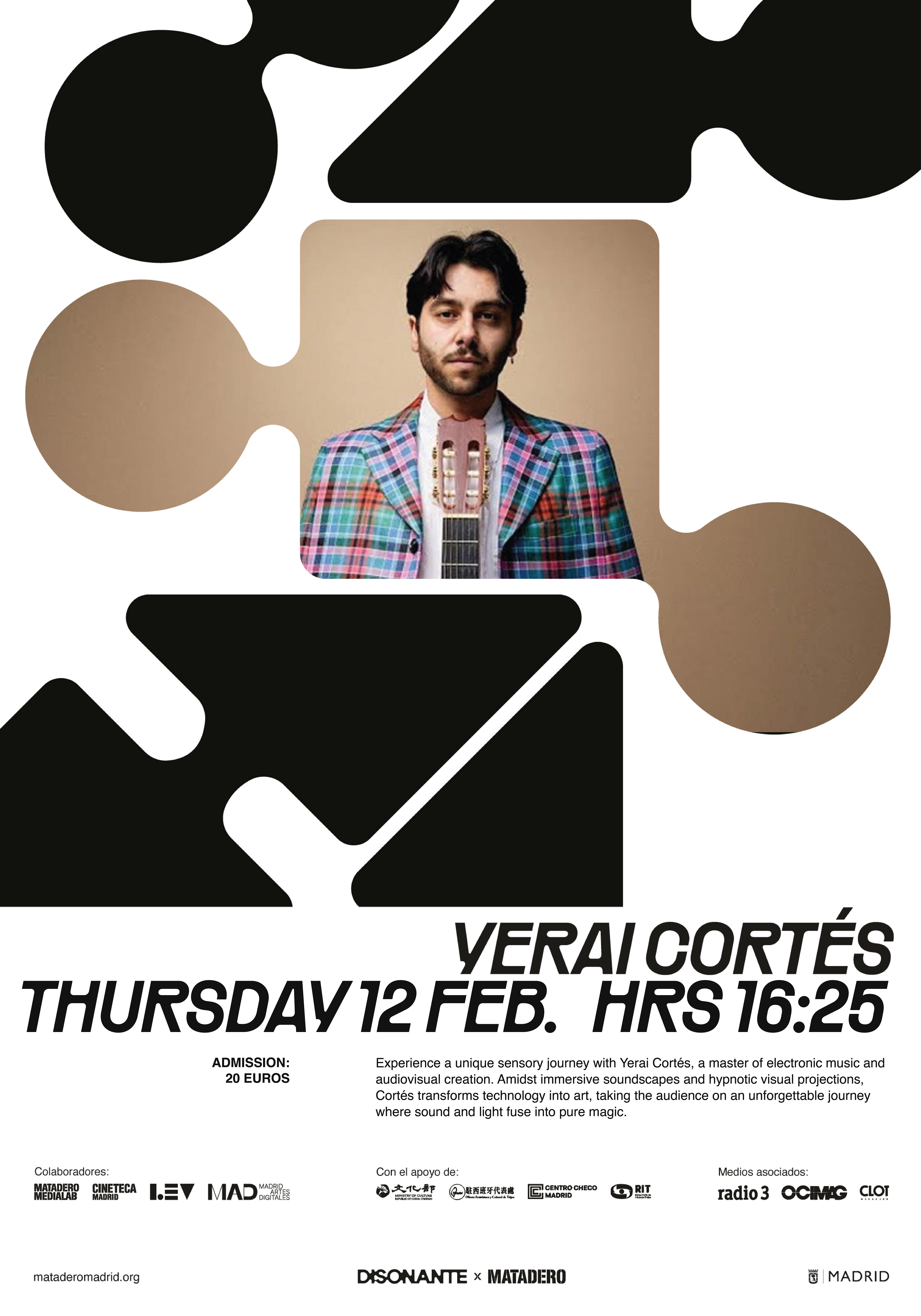
The Circles: Capturing continuous flow and the unbroken, hypnotic rhythm of sound.
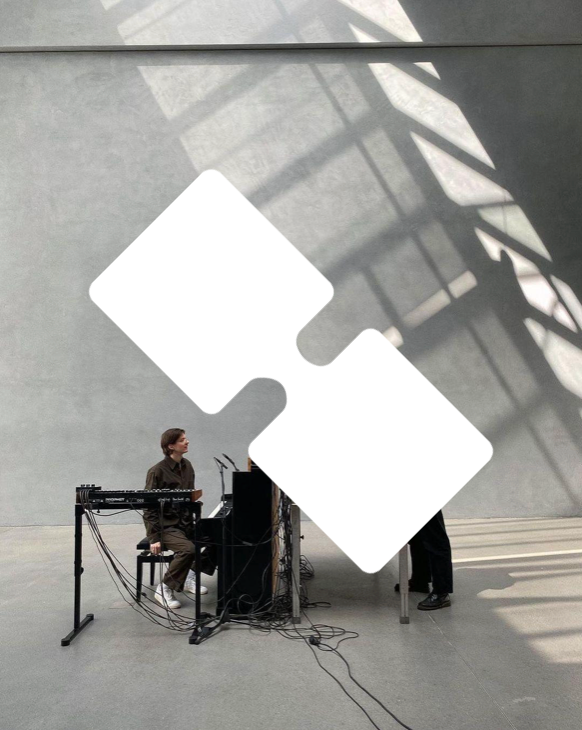
The Squares: Acting as the heavy structural baseline and stability that holds a track together.
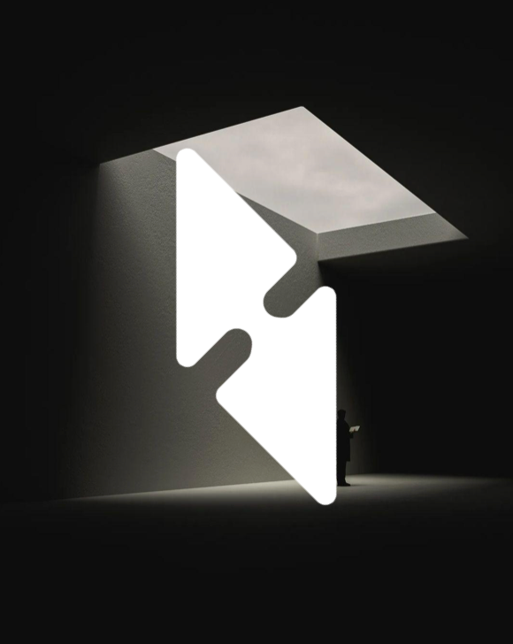
The Triangles: Channeling raw tension, sharp dynamic contrasts, and emotional release.
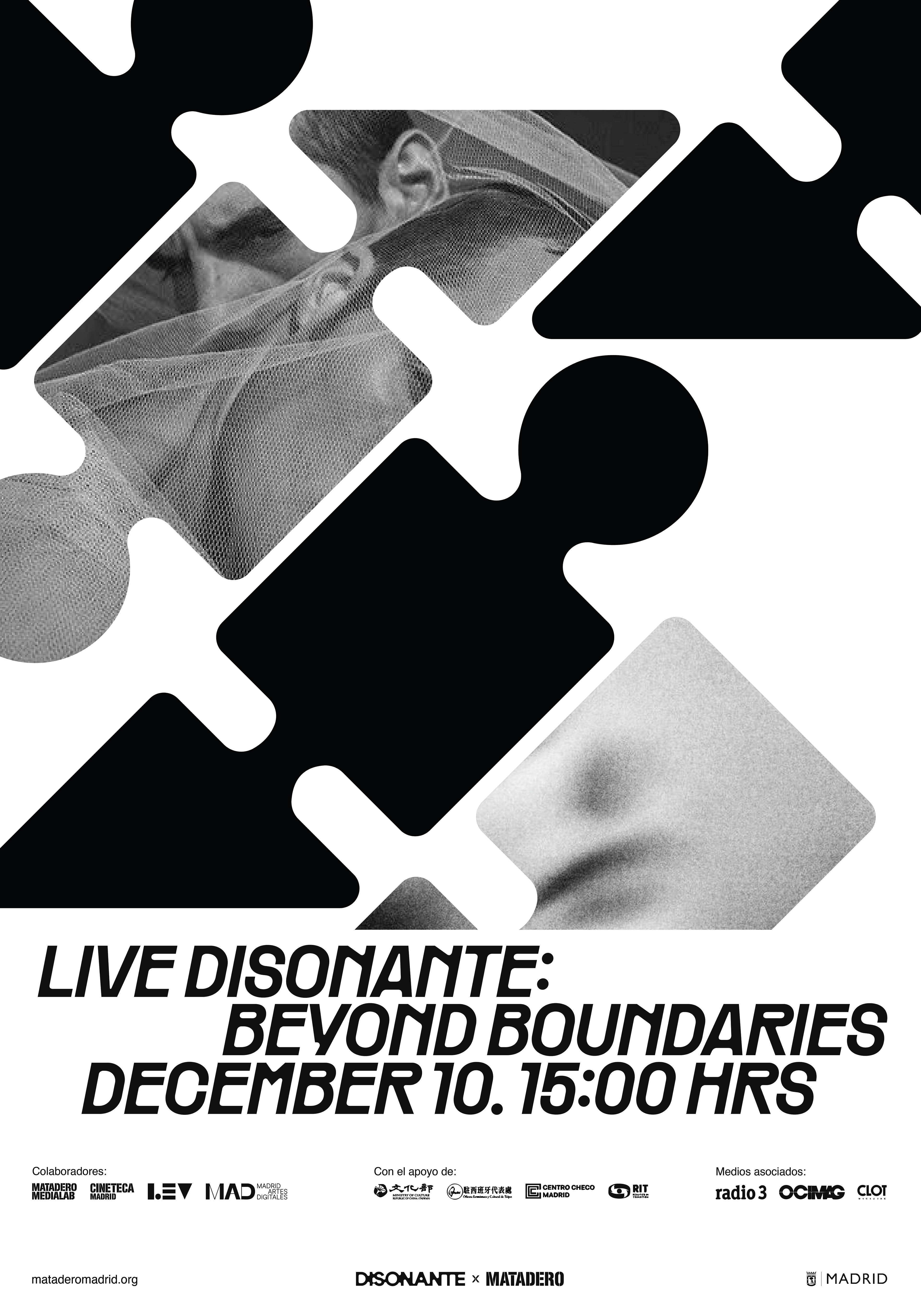
Printed program poster
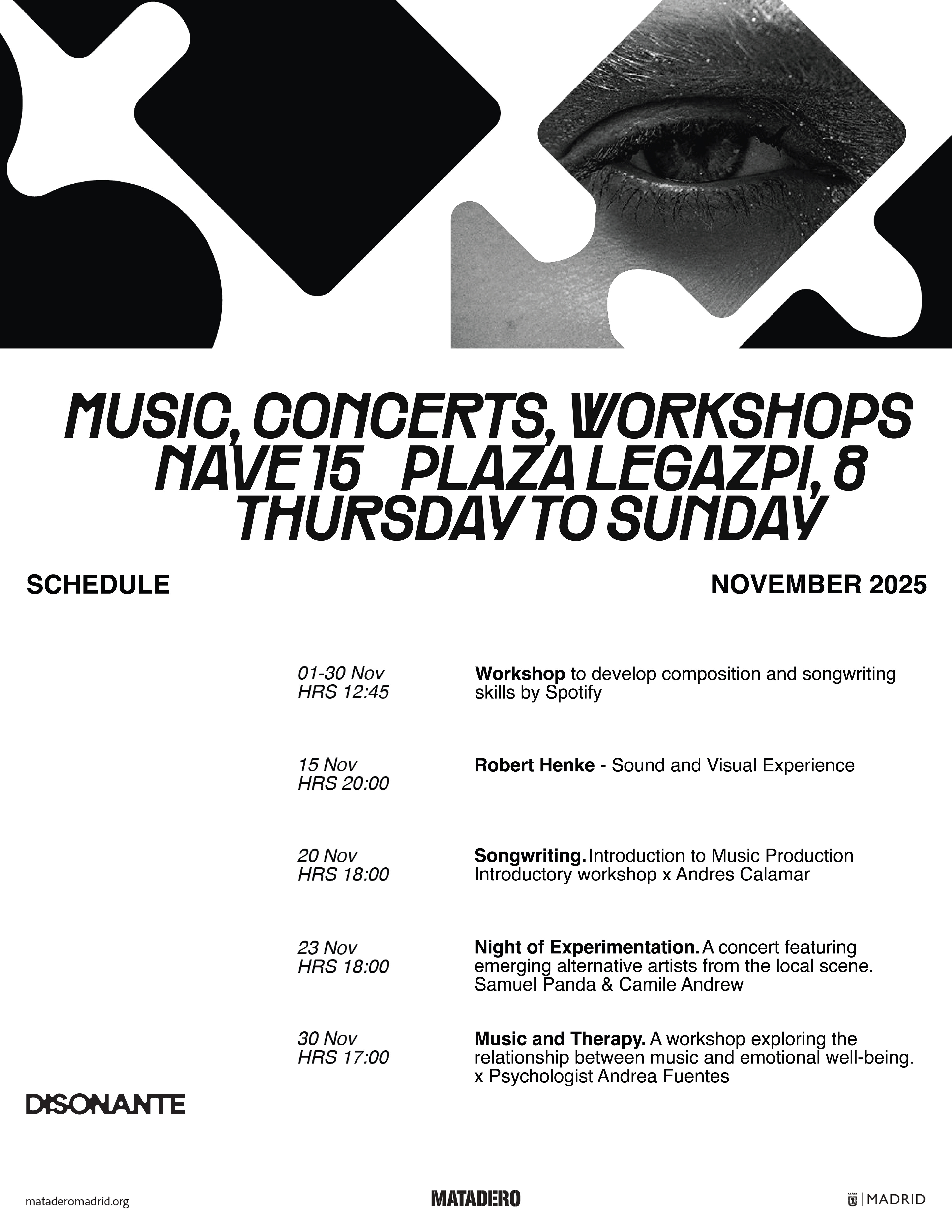
Printed program poster
The Modular Grid: Structure & Rhythm
That dynamic energy is anchored by a precise modular grid, built to mirror the structured score of a musical composition. Far from being a rigid box, it acts as a flexible framework to orchestrate heavy event programming, dates, and copy without losing clarity or impact.
Aligning content to these modular blocks guarantees sharp consistency across every poster, while still giving fluid elements and bold headings the freedom to punch through the structure with raw momentum.
Spanish Grid system breakdown
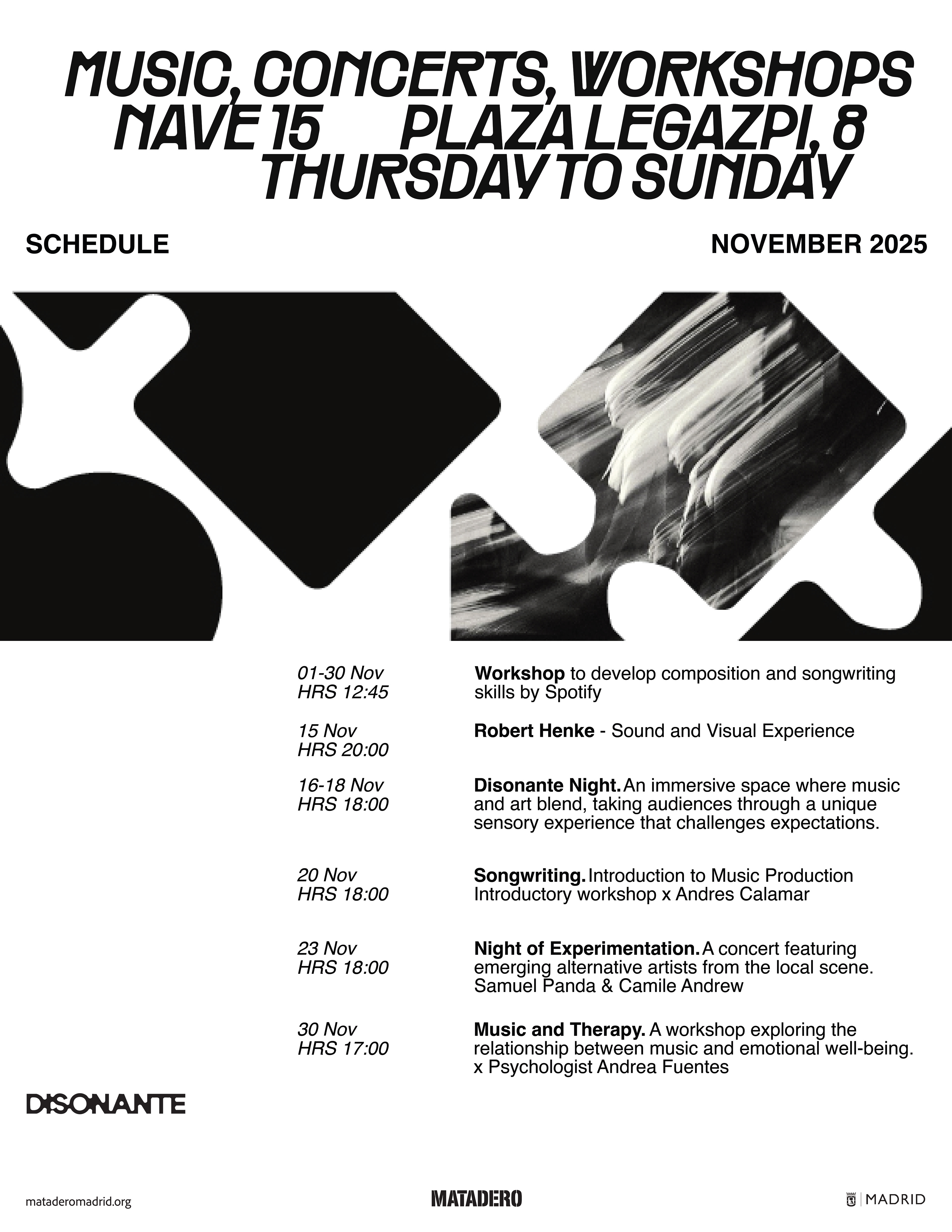
Printed program poster
Strong Foundations: Making Room for Color
Because the monochromatic foundation is so solid, the system naturally earns the right to expand, allowing color to enter as an intentional electric shock.
Once color is introduced into the geometric shapes, select photography breaks free from black-and-white to join the system. This creates a striking visual tension -stark monochrome colliding with vibrant color blocks and full-color imagery -to electrify the brand's ecosystem.
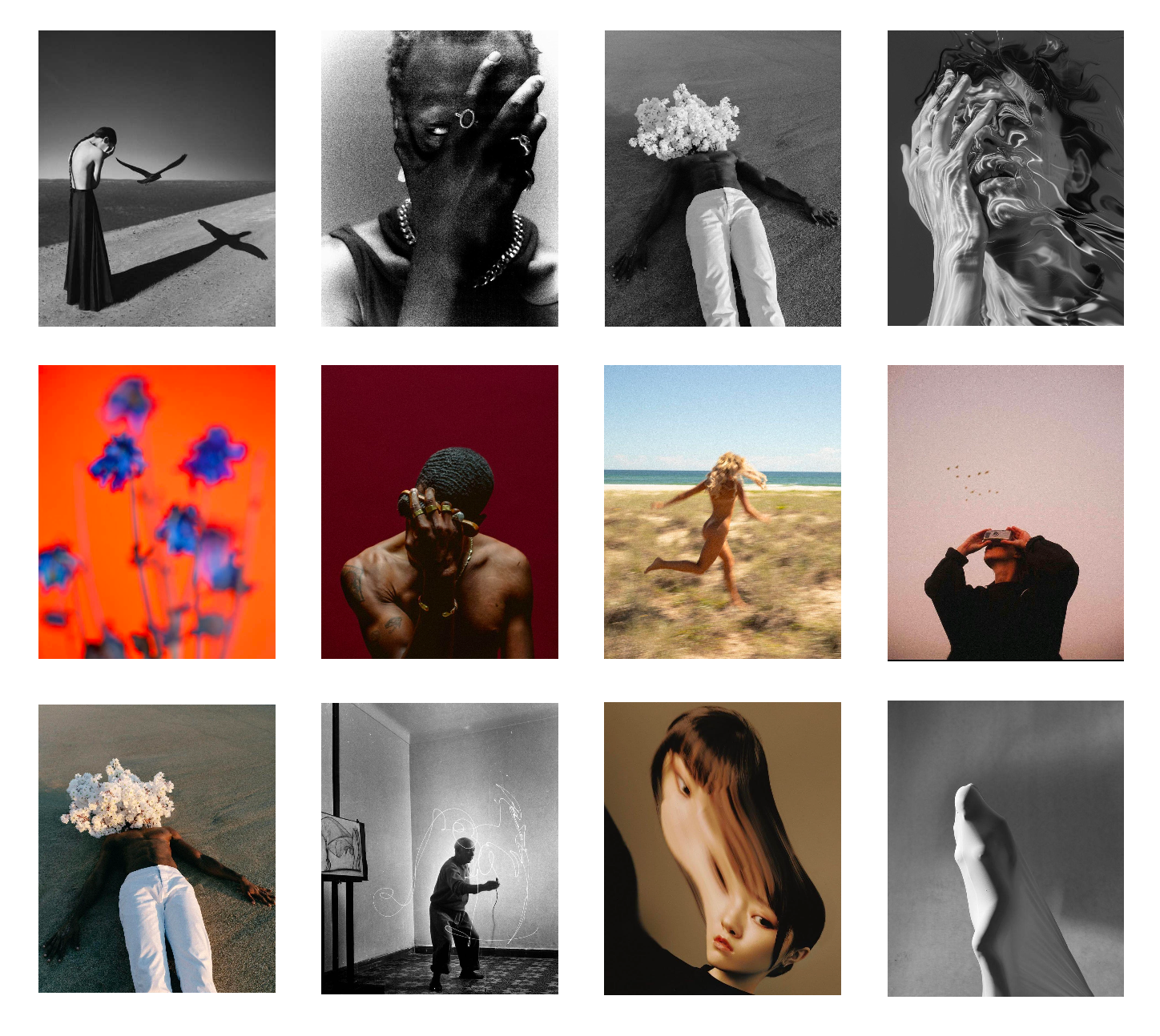
Photography mood board
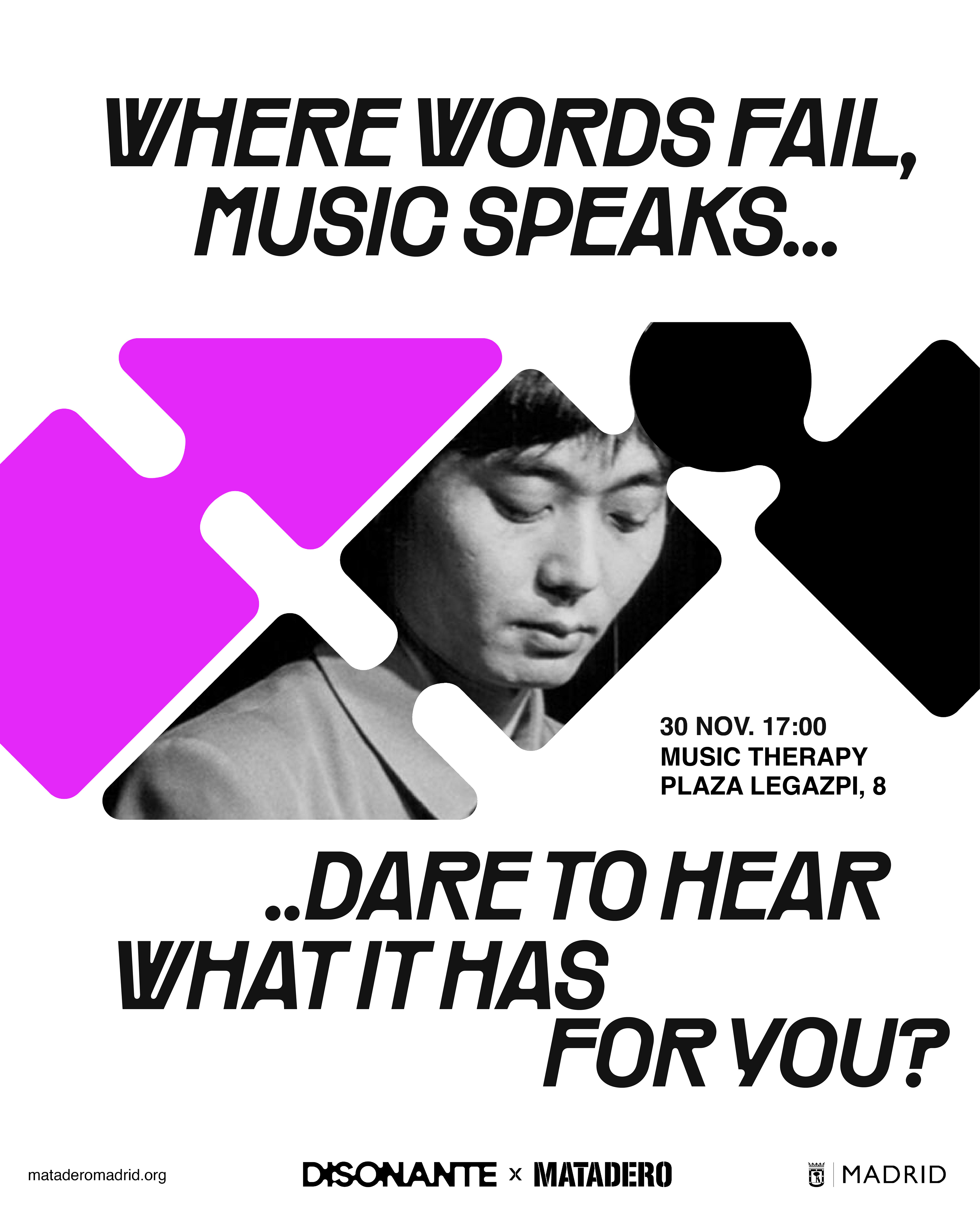
Instagram post layout
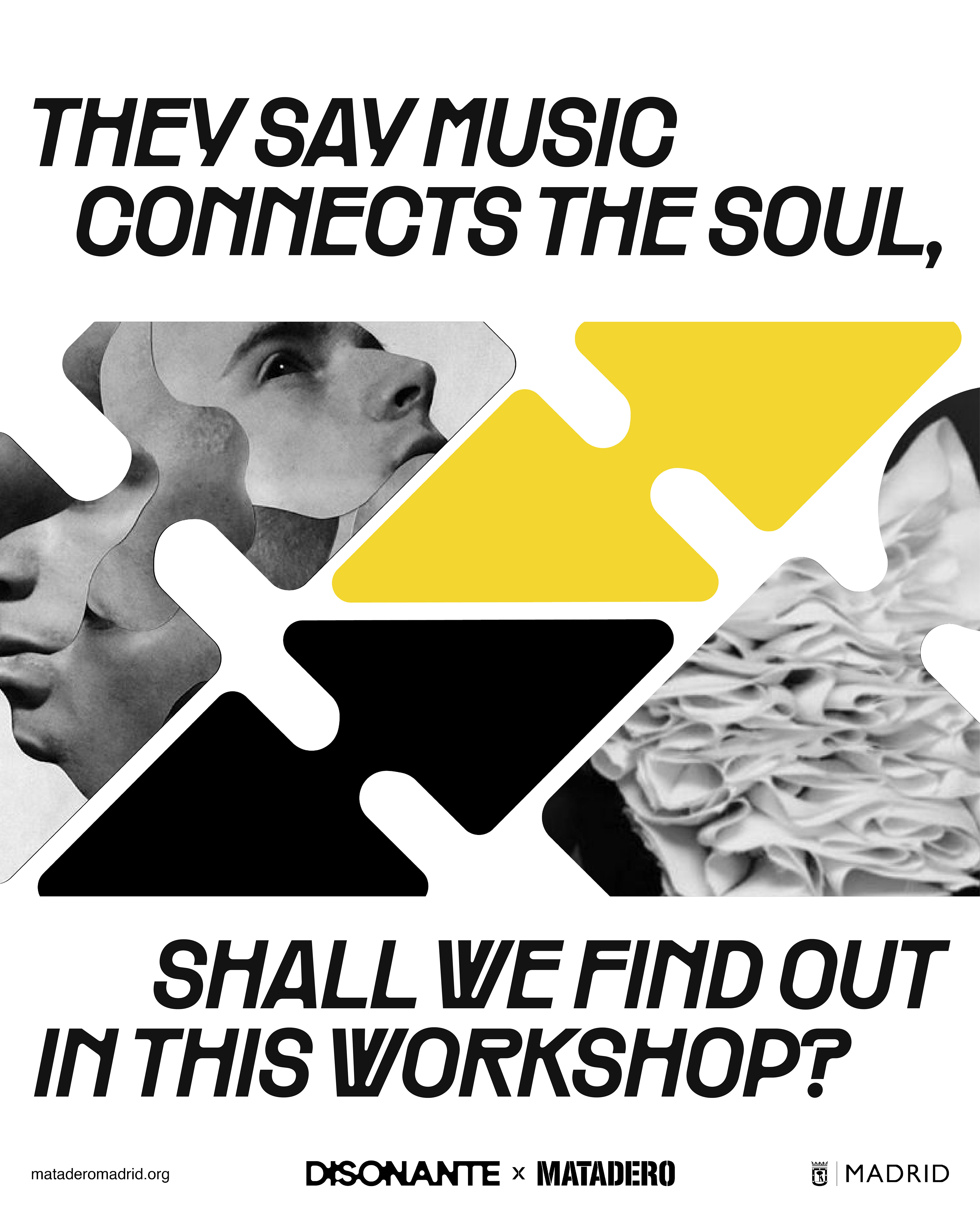
Instagram post layout
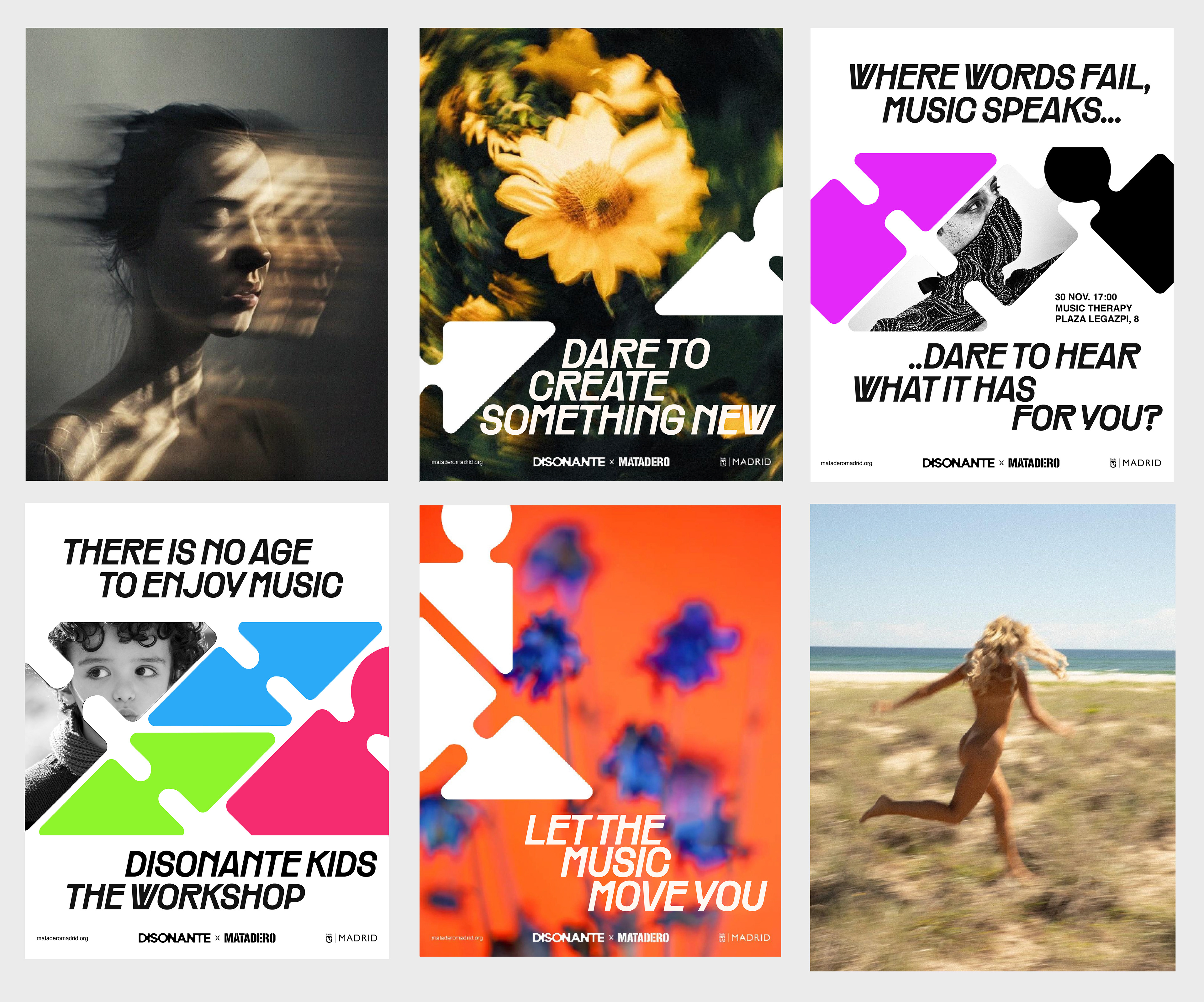
Instagram grid system
Spatial Presence: From Digital to the Streets
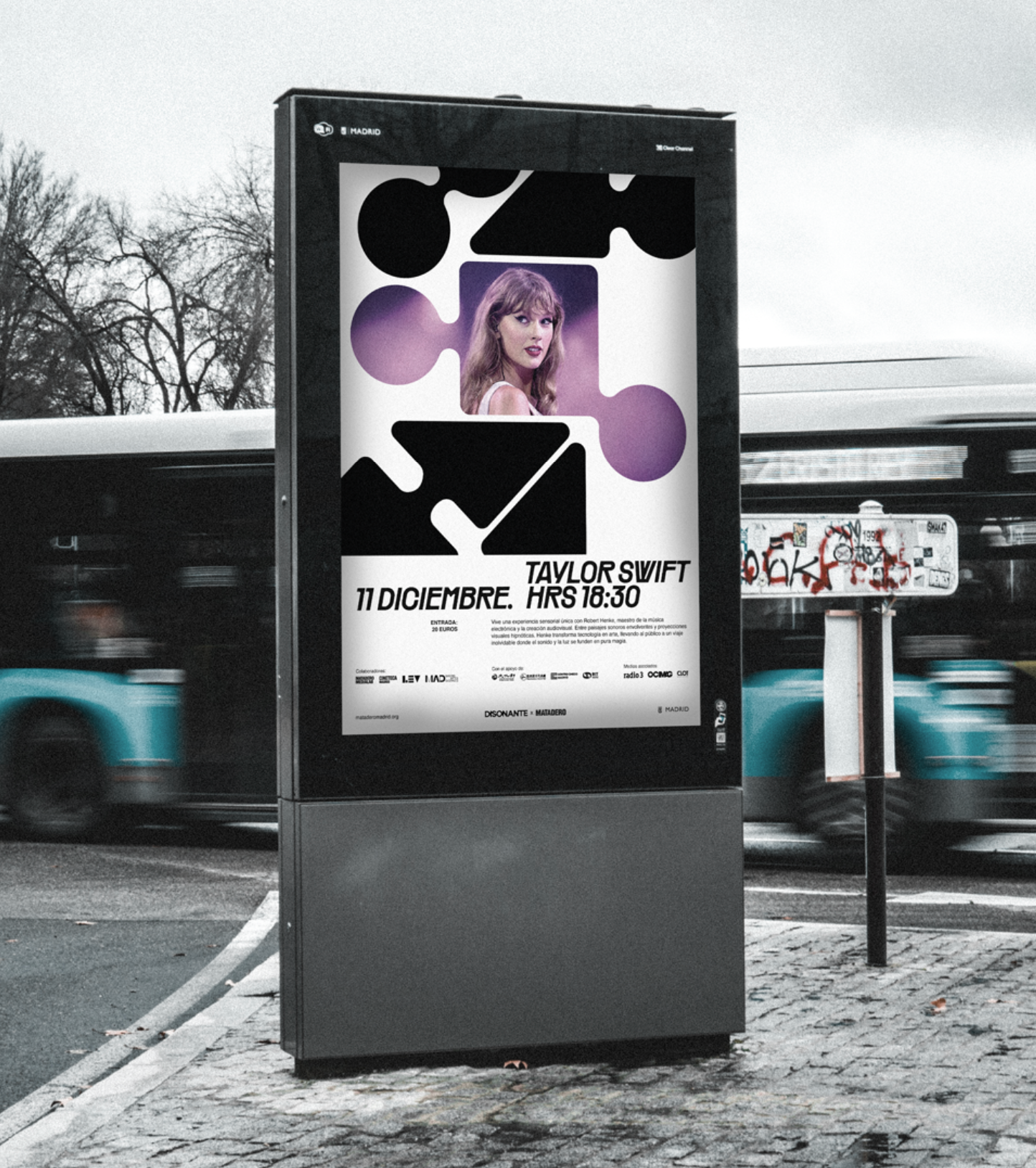
While the identity thrives in the digital space, its true scale comes alive out in the open. The brand breaks free from the screen to dominate the urban landscape -taking over billboards, public spaces, and MUPIs across the city.
By scaling up the interlocking shapes, modular grid, and stretched typography, Disonante transforms public transit stops and architectural facades into immersive spatial experiences. The streets themselves become an extension of the stage, turning every corner into a physical encounter with the unexpected.
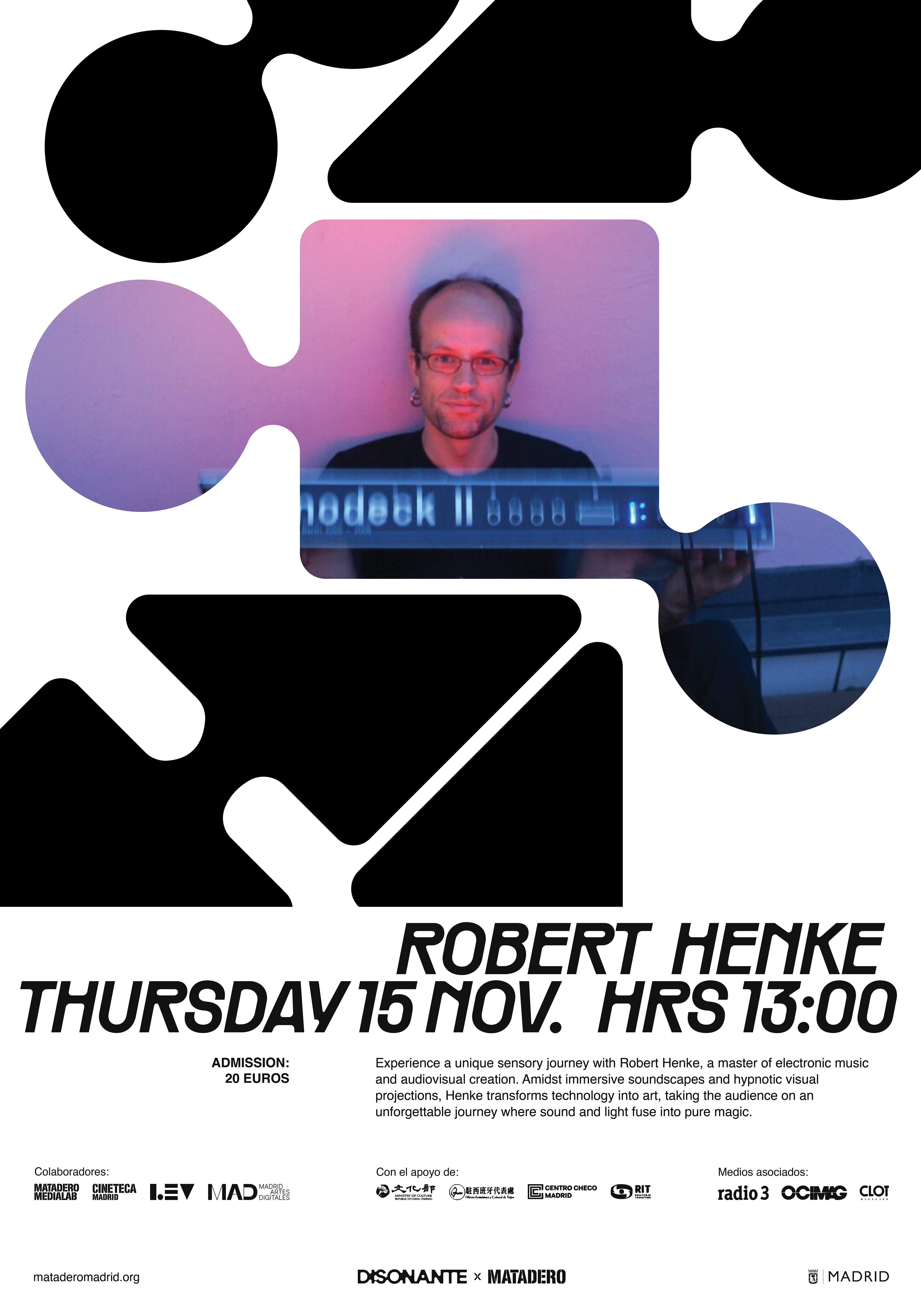
Mupi poster graphic
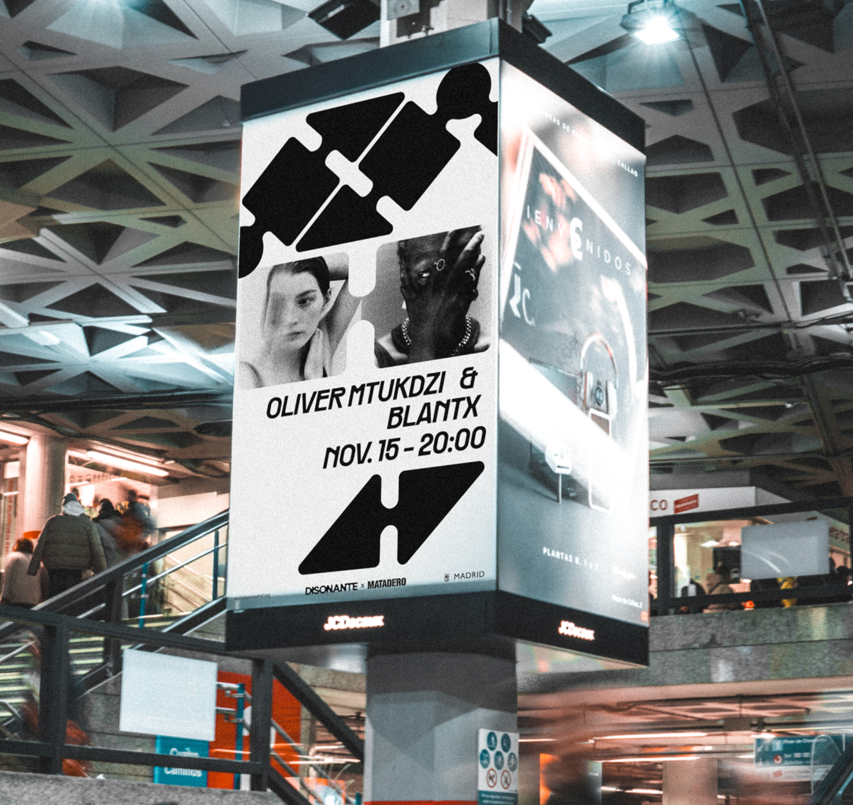
Madrid Metro billboard
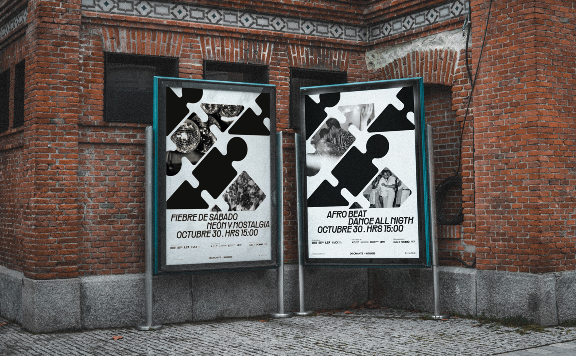
Twin event Mupi poster application
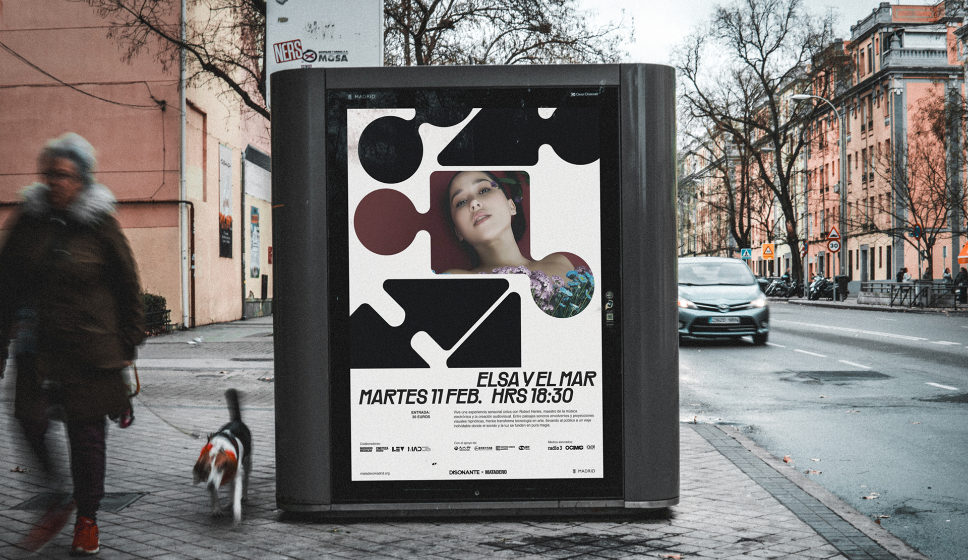
Outdoor advertising: Single event Mupi display
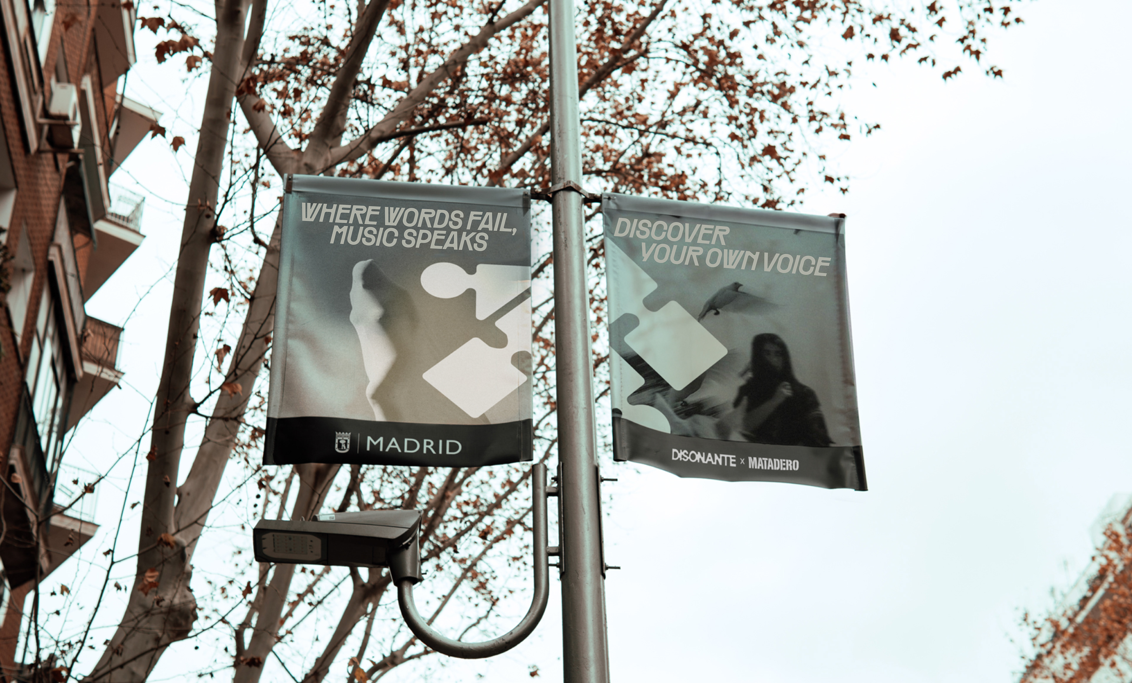
Outdoor advertising: Twin event pole banner application