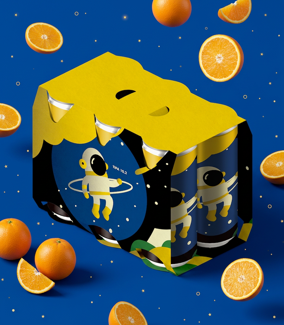
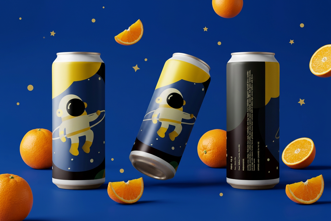
The IPA Label Design Series is a spec work project exploring how visual identity can transform product packaging into a memorable brand experience. The series features three distinct beer varieties - Hazy IPA, DIPA, and TIPA - each expressing a unique personality through bold illustration, vibrant color palettes, and playful storytelling while staying unified as part of a cohesive product family.
Challenge: Develop a flexible packaging system that allows each beer variety to stand out independently on the shelf while maintaining a strong, recognizable brand identity. The core challenge was to visually communicate different flavor profiles and personalities through distinct labels without sacrificing consistency or cohesion across the entire collection.
Client: Self-Initiated Project
Deliverables:
- Can label designs for Hazy IPA, DIPA, and TIPA
- Packaging design for bottles and cartons
- Brand color palette and typography system
- Product mockups and presentation materials
- Packaging design for bottles and cartons
- Brand color palette and typography system
- Product mockups and presentation materials
Year: 2025
Role:
• Packaging Design • Brand Identity • Illustration • Art Direction • Typography • Product Visualization
DIPA 8.4 Packaging Design: A Hypnotic Visual Identity
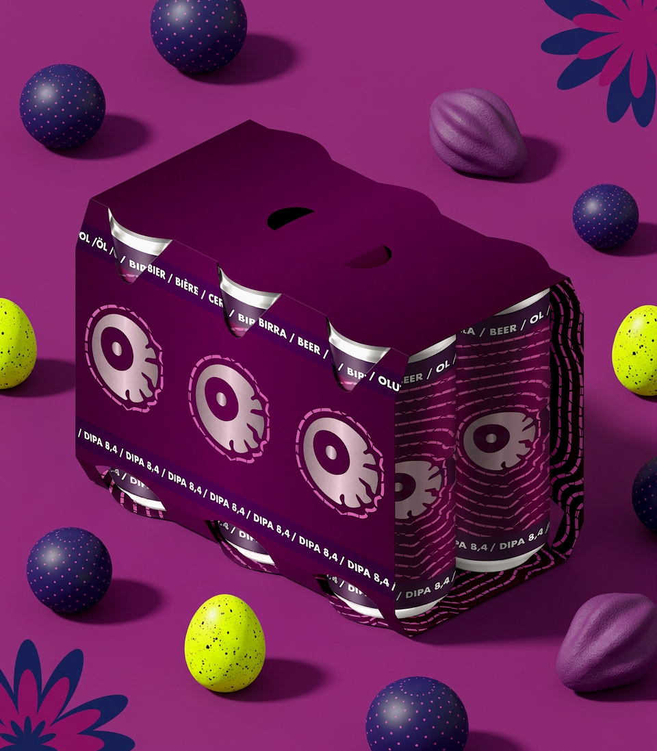
DIPA 8.4%: Can design and exterior carrier.
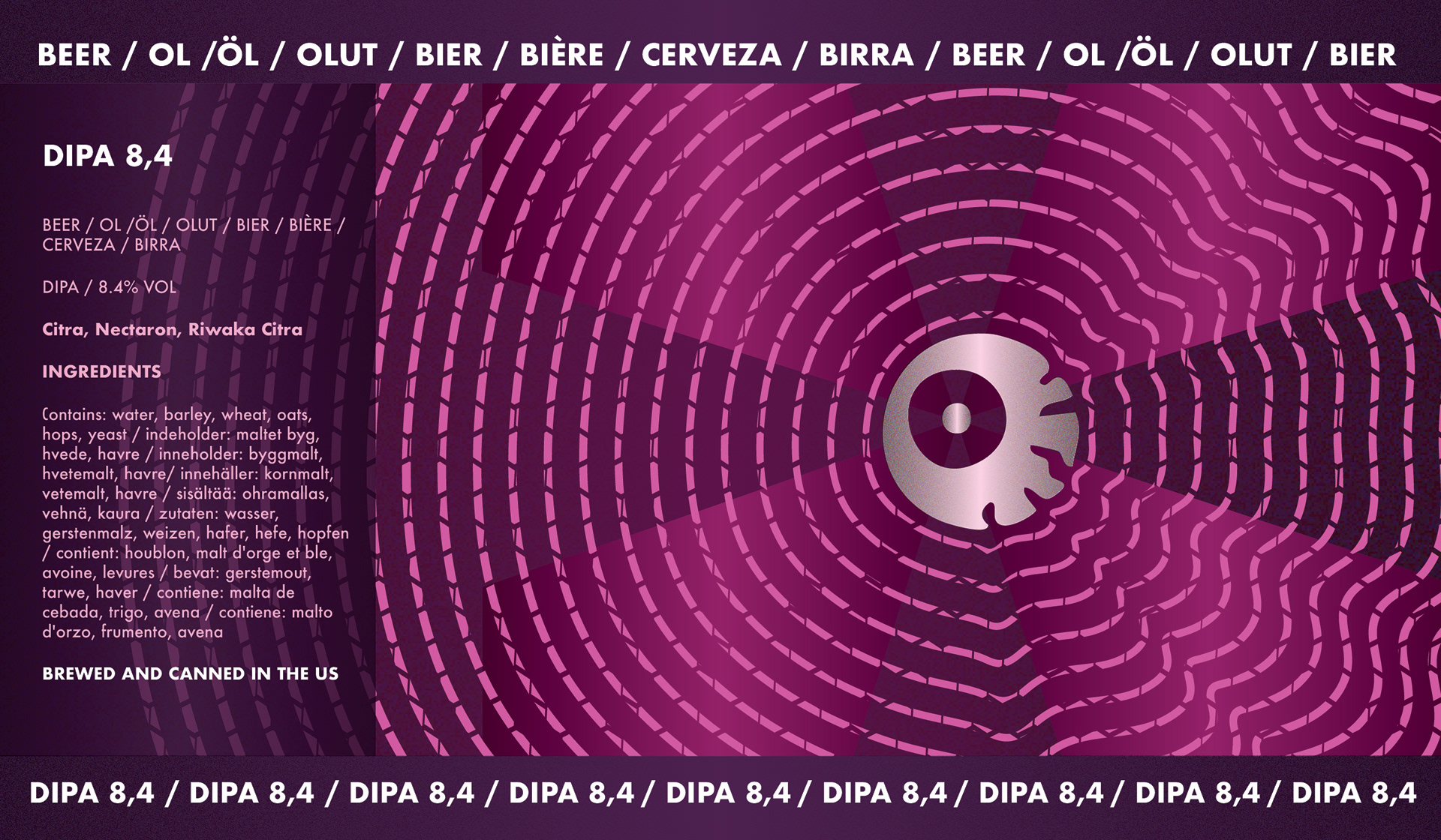
DIPA 8.4% complete label flat artwork
Look straight into the deep purple vortex and you’ll find the real hook: a striking central eye locking right onto you amid a mesmerizing, hypnotic wave pattern. Wrapped in an intense clash of deep indigos and electric violets, it’s mysterious, nocturnal, and stands completely on its own in the craft beer universe.
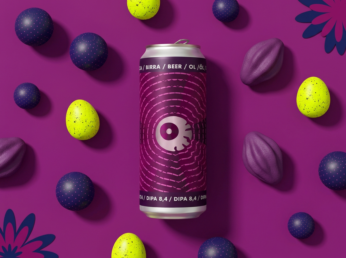
Front view
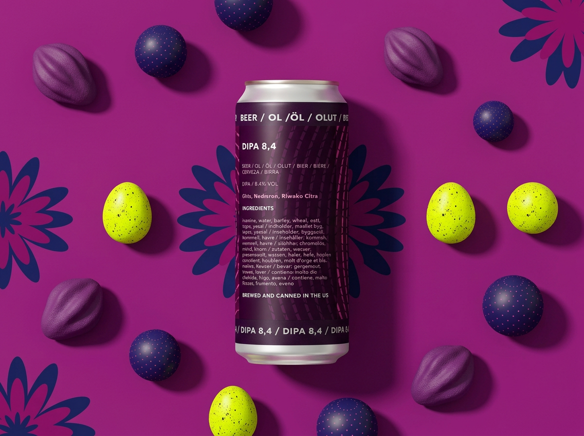
Back view (Ingredients and details)
Hazy IPA 6.4 Packaging Design: An Out-of-This-World Visual Identity
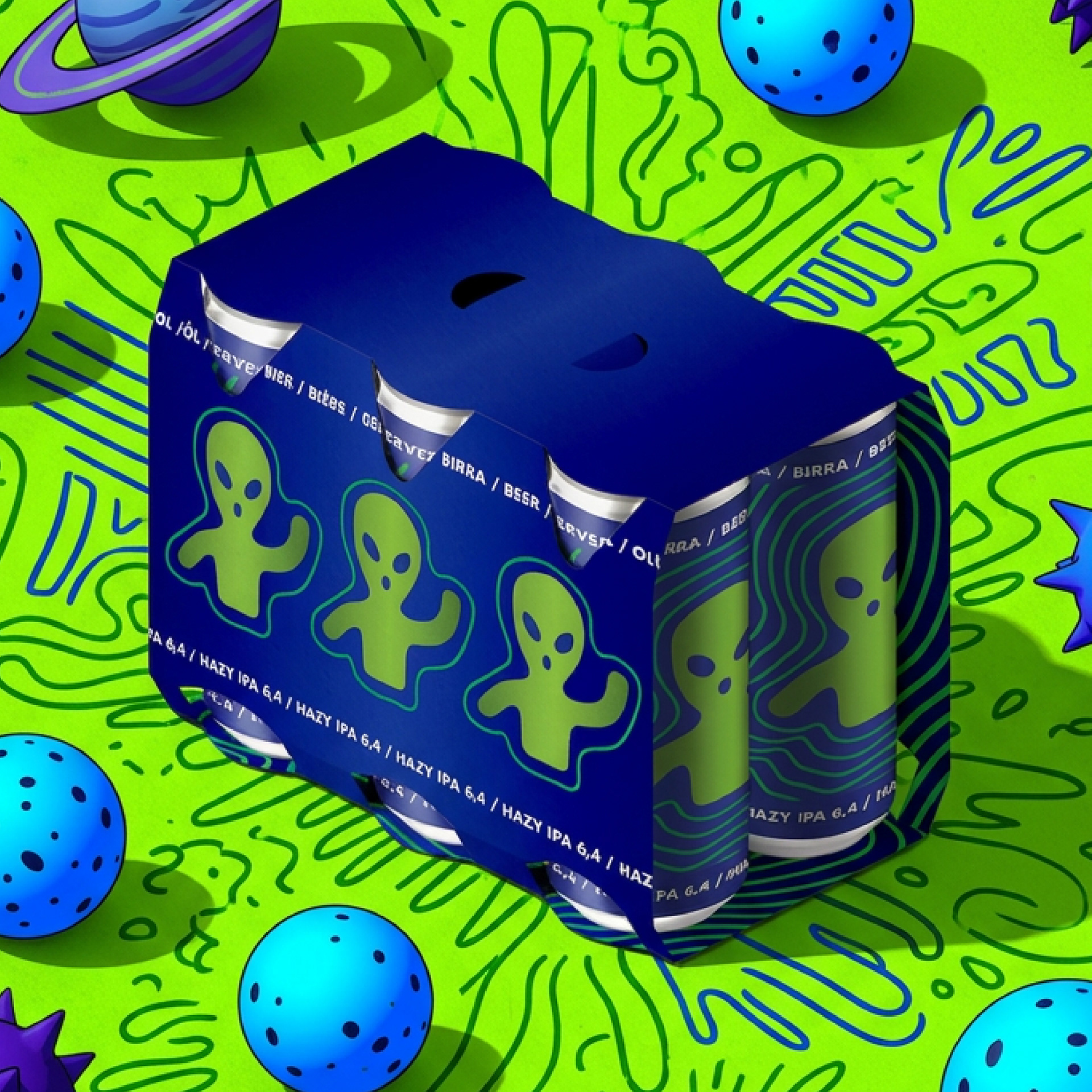
Hazy IPA 6.4%: Can design and exterior carrier.
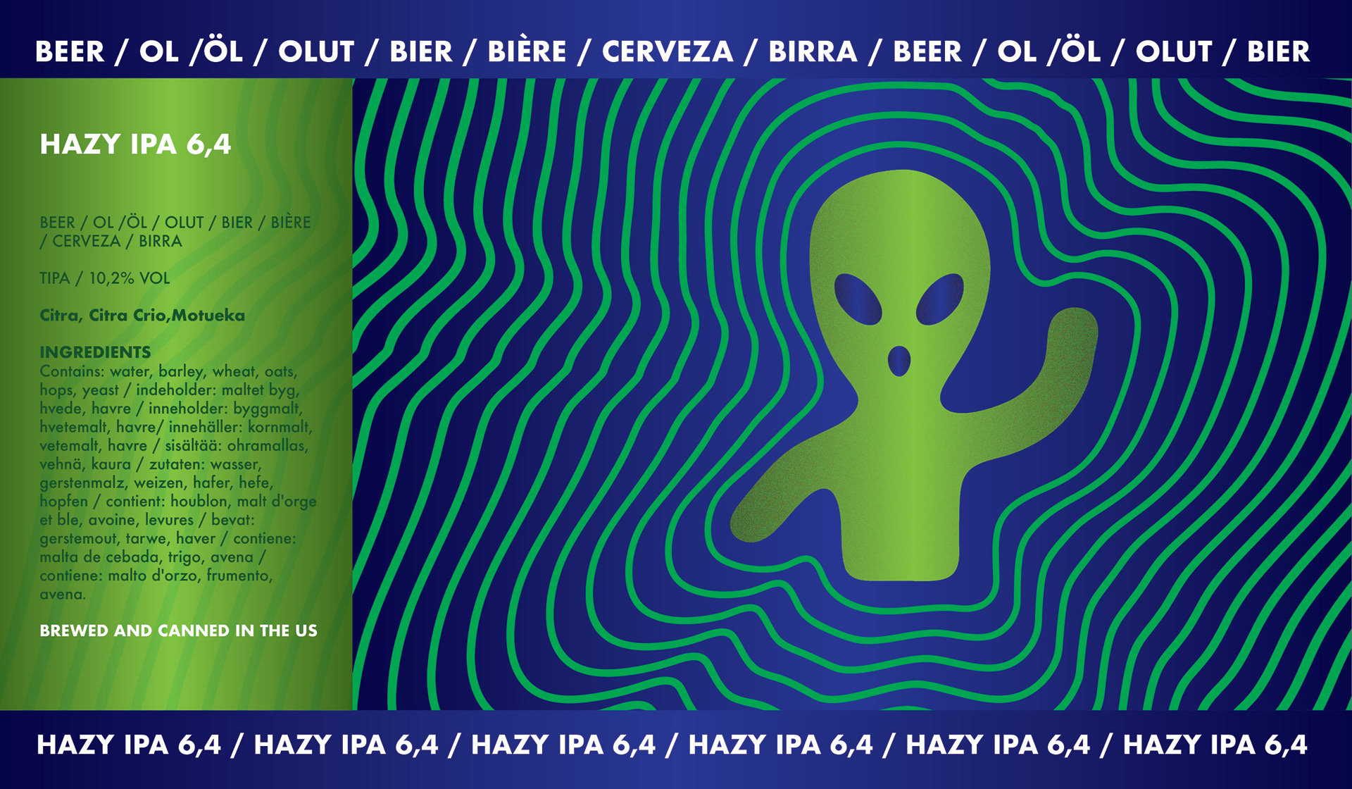
Hazy IPA 6.4% complete label flat artwork
Drift past the glowing energy fields and you’ll catch the real joke: a friendly extraterrestrial waving right from the middle of a pulsing lime-green tunnel. Dressed in a bold mix of rich cobalts and electric shades, it’s eccentric, bizarre, and totally owns its own corner of the market -dropping straight in from outer space.
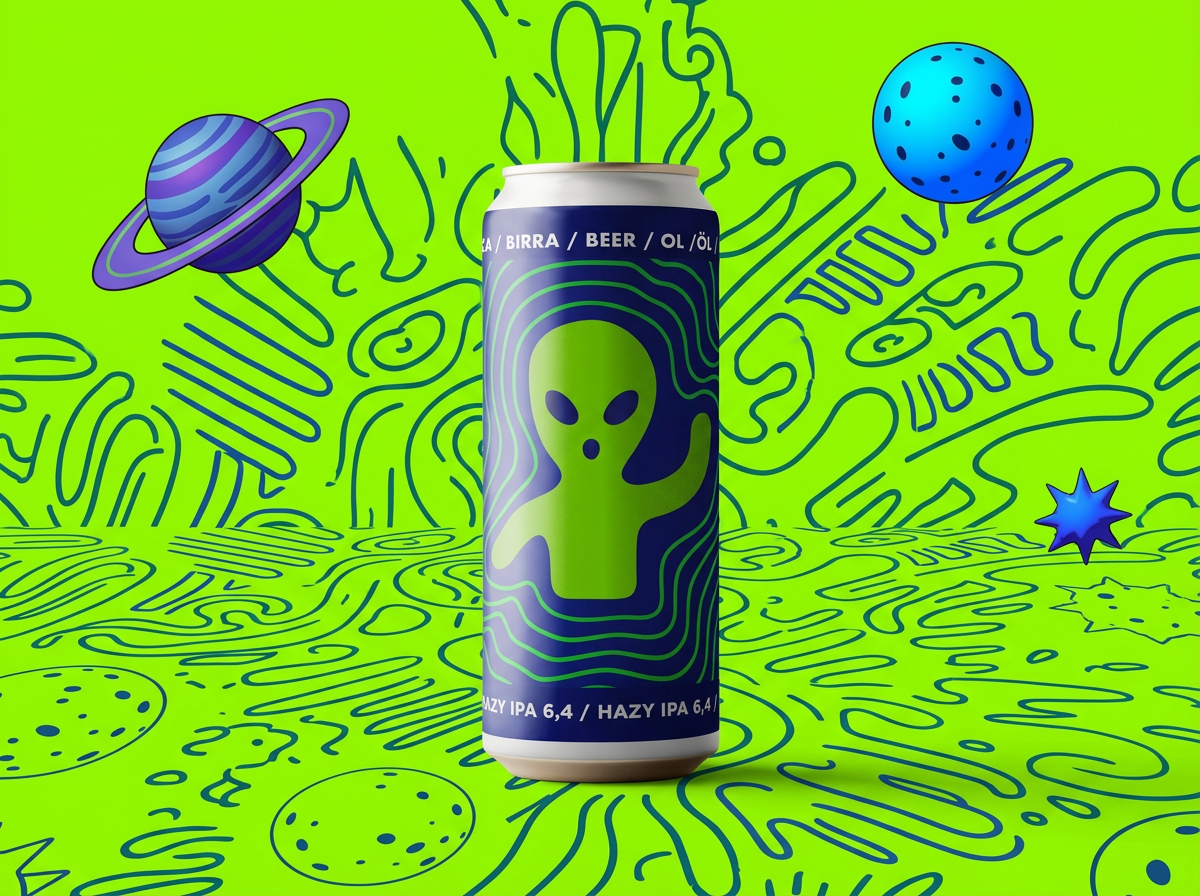
Front view
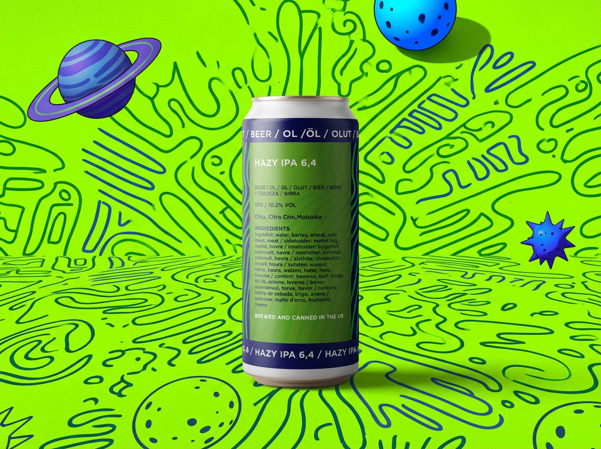
Back view (Ingredients and details)
TIPA 10.2 Packaging Design: A High-Voltage Cosmic Identity
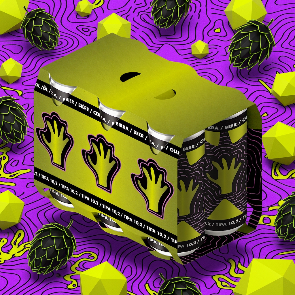
TIPA 10.2%: Can design and exterior carrier.
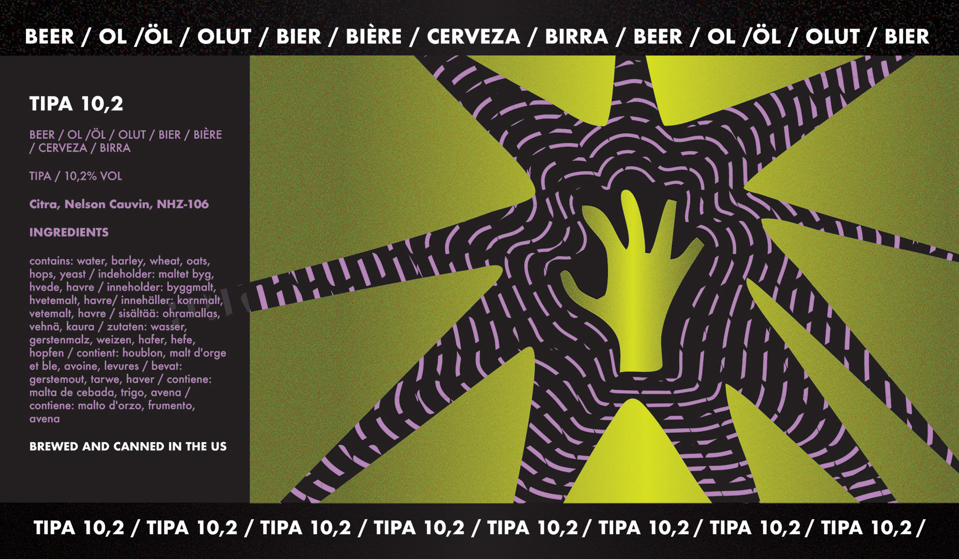
TIPA 10.2% complete label flat artwork
Look past the chaotic geometry and you’ll find the real trip: a custom background pattern woven with sprawling star-like waves and a reaching hand graphic right in the center. Wrapped in an intense clash of acid greens, deep violets, and cosmic blacks, it’s loud, heavy-hitting, and looks like an absolute statement piece in the craft beer game -delivering the monster energy of a 10.2% ABV brew.
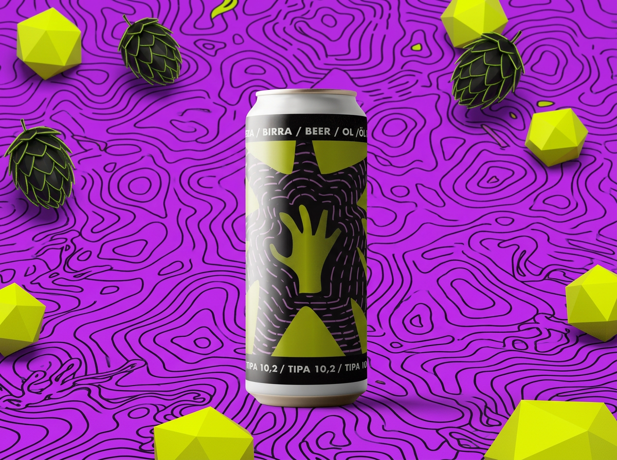
Front view
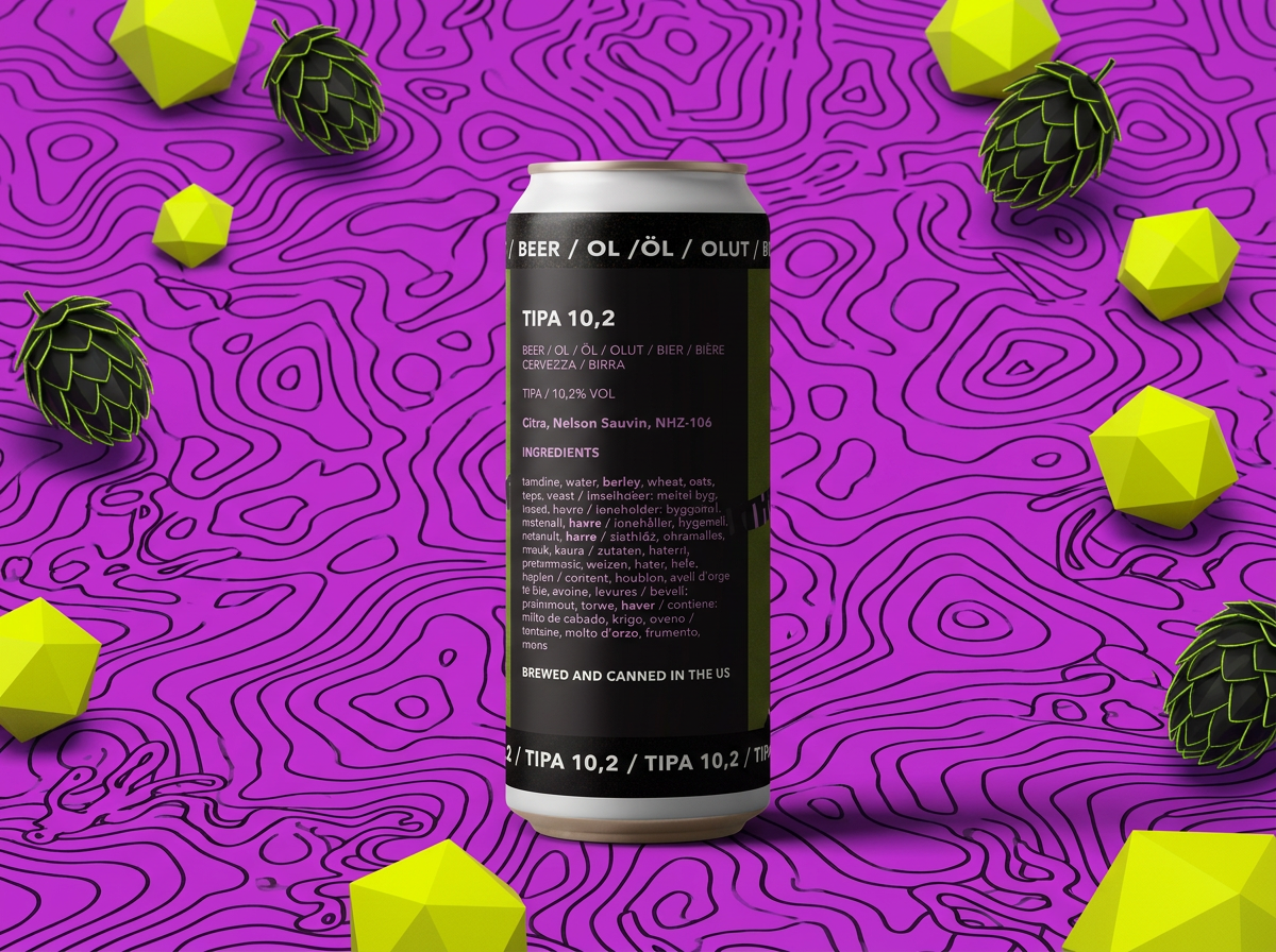
Back view (Ingredients and details)
DIPA 8.4 Packaging Design: A Vibrant Prism Identity
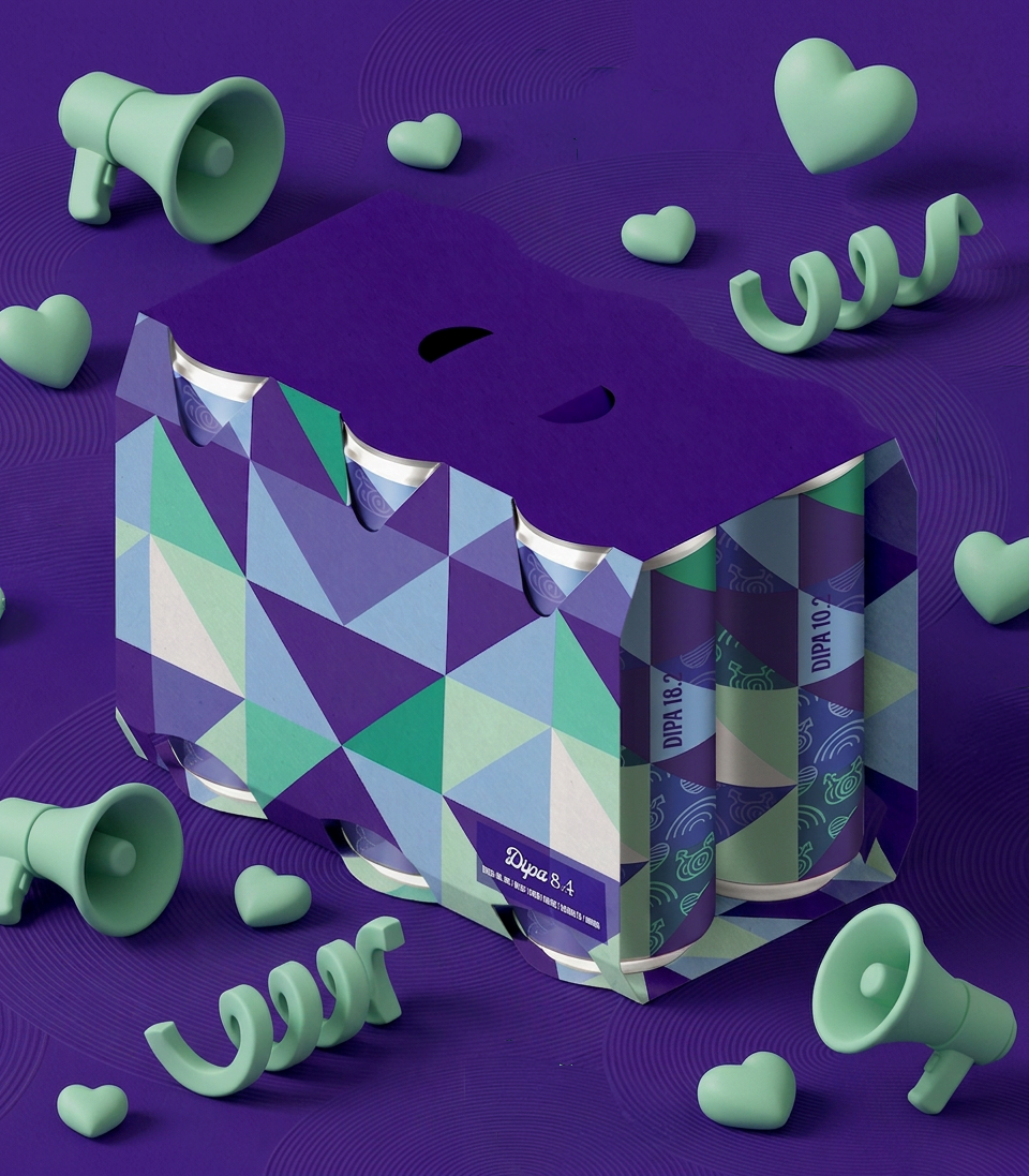
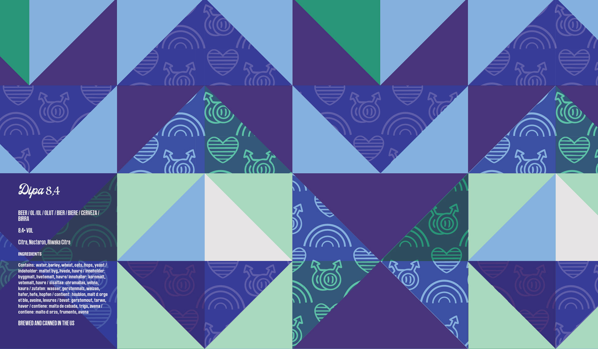
Zoom in past the sharp triangles and you’ll catch the real magic: a clever, custom background pattern packed with hidden pride symbols, hearts, and mini rainbows layered right into the blues. Wrapped in a punchy mix of electric greens, rich indigos, and bright azures, it’s loud, meaningful, and looks like an absolute statement piece in the craft beer game -proudly standing out as part of our LGBTQIA+ series.
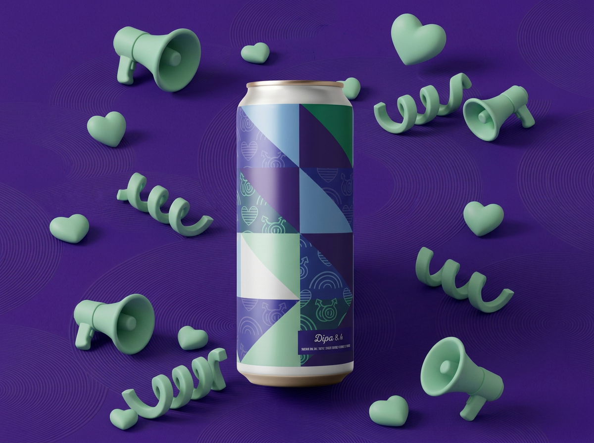
Front view
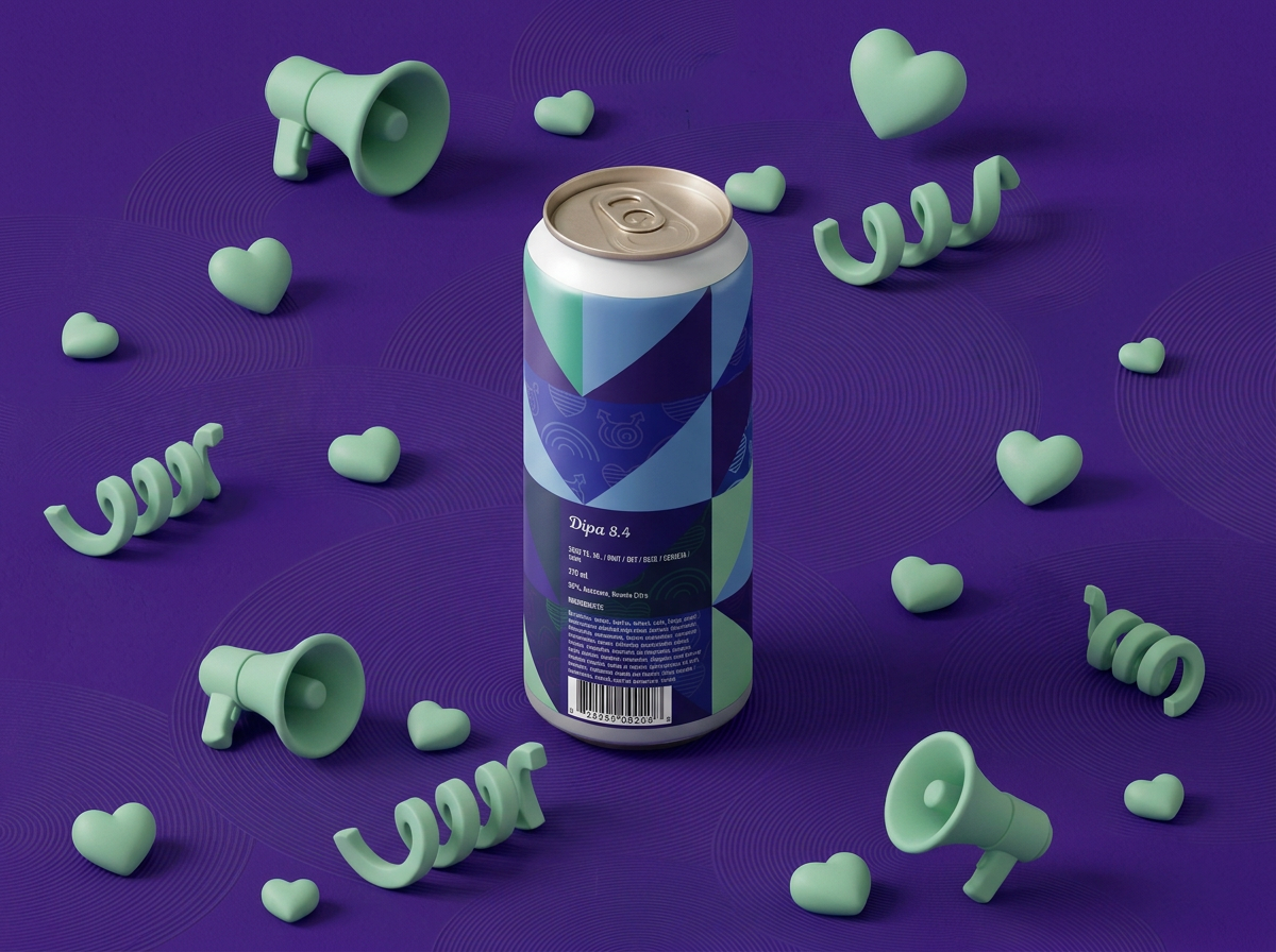
Back view (Ingredients and details)
Hazy IPA 6.4 Packaging Design: A Radiant Sisterhood Manifesto
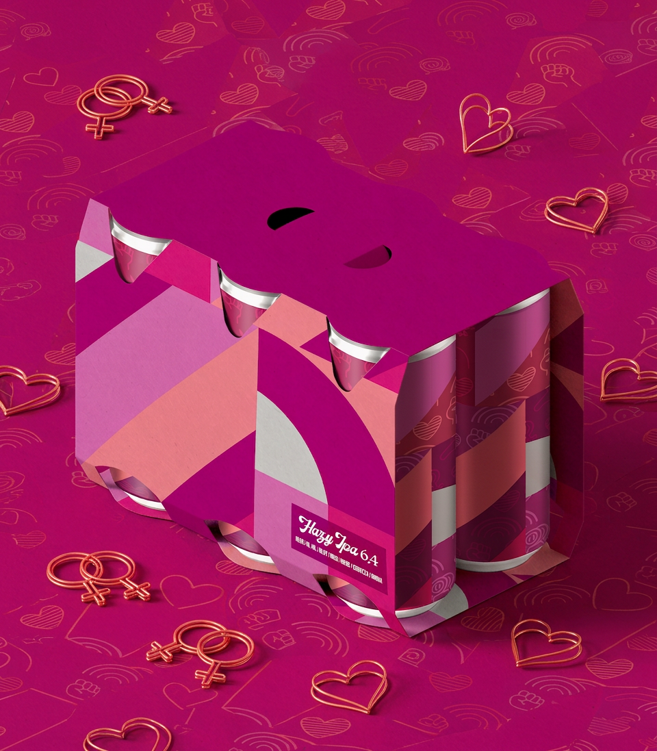
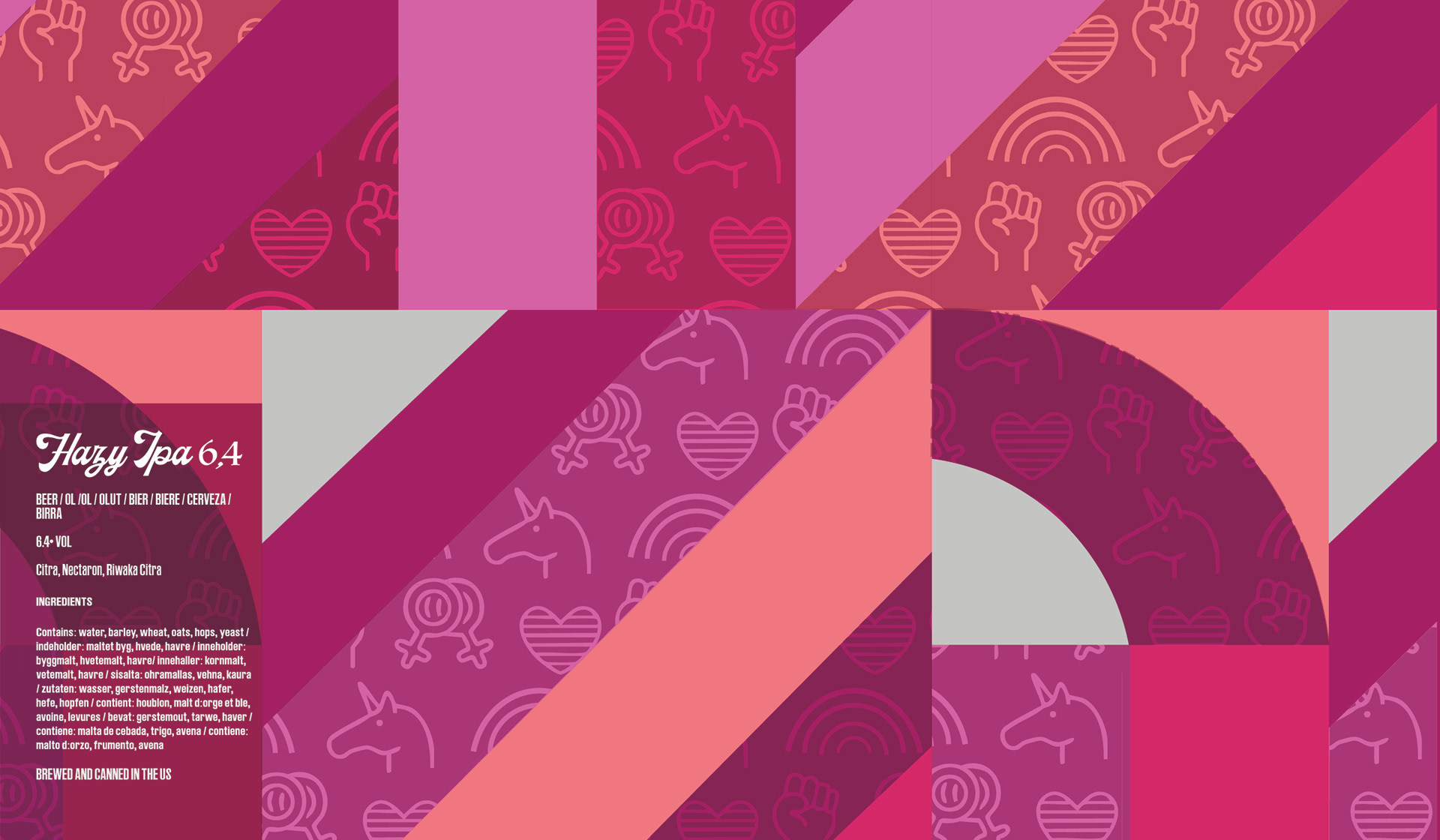
A clever, custom background pattern packed with hidden pride symbols, hearts, and mini rainbows layered right into the magentas. Wrapped in a punchy mix of deep magentas, soft blushes, and warm roses, it’s loud, meaningful, and looks like an absolute statement piece in the craft beer game -proudly standing out as part of our sapphic series.
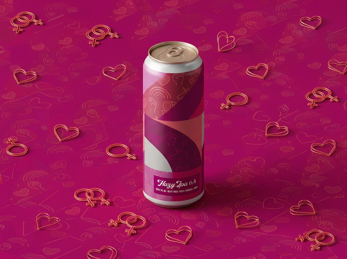
Front view
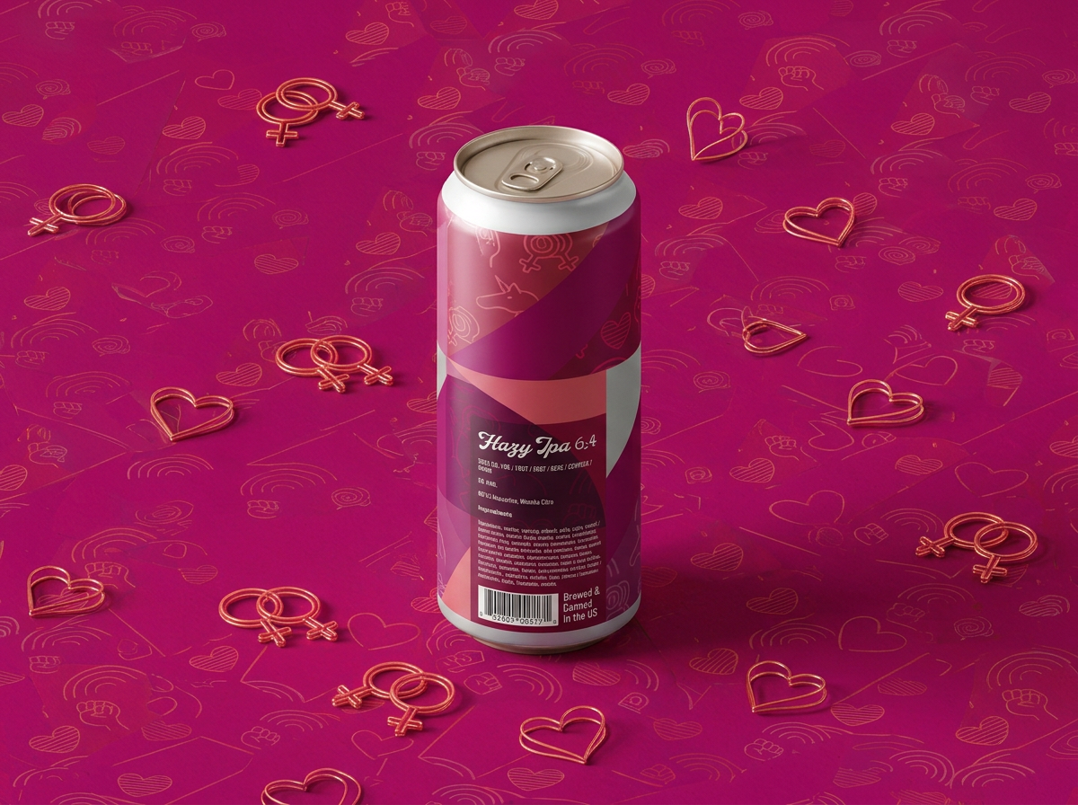
Back view (Ingredients and details)
TIPA 10.2 Packaging Design: A Luminous Pride Symphony
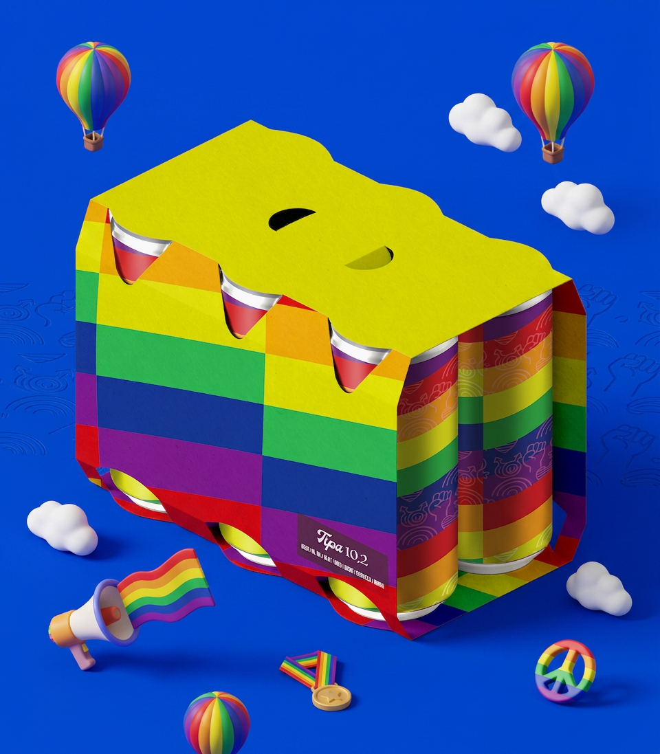
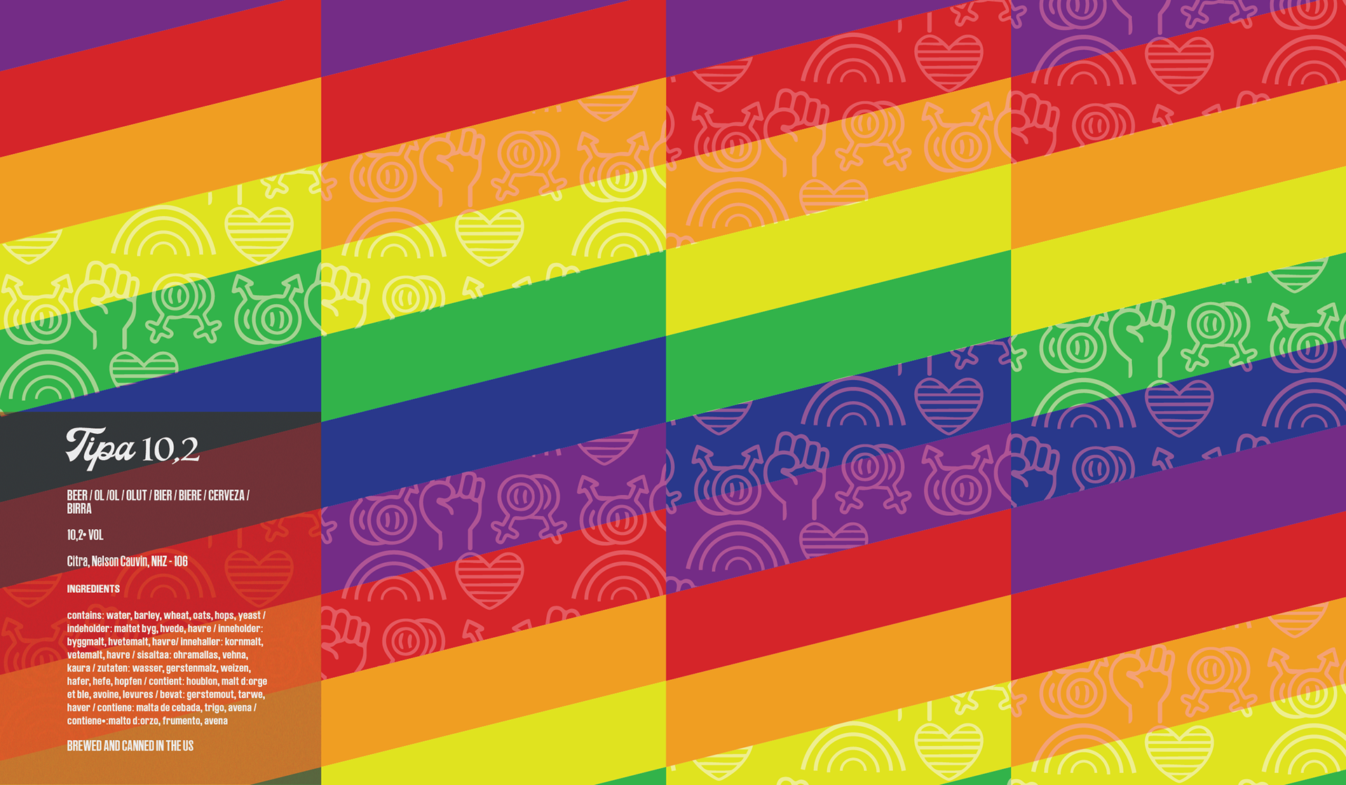
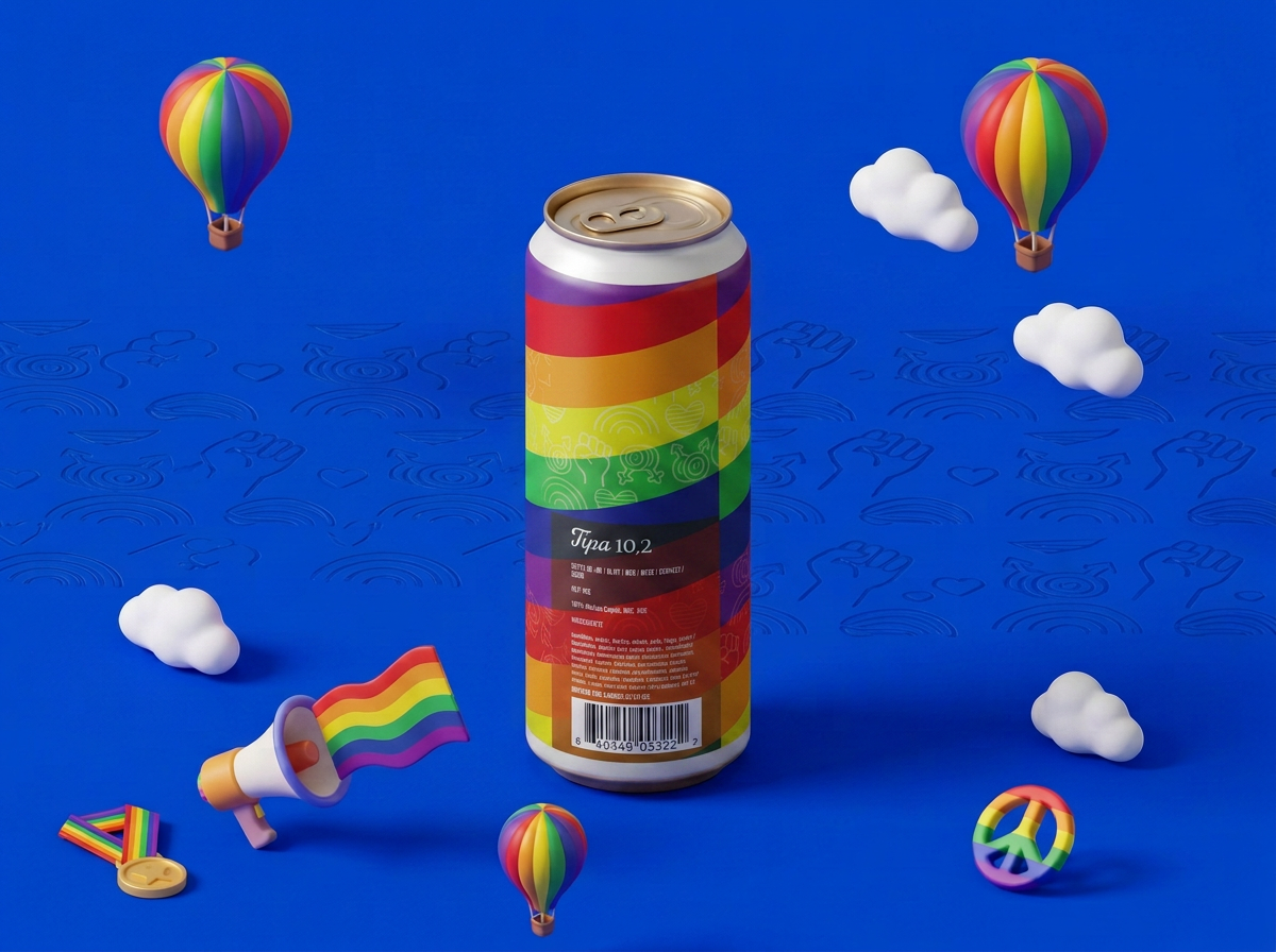
Traversing the iconic spectrum stripes reveals the true core of the design: an intricate, bespoke surface pattern filled with subtle raised fists, interlocking gender symbols, and mini rainbows layered directly into the vibrant diagonal bands of the Pride flag. Draped in a striking, dynamic clash of saturated reds, oranges, yellows, greens, blues, and purples, it’s bold, deeply meaningful, and acts as a true standout fixture in the craft beer arena—proudly shining as a core piece of our inclusive LGBTQIA+ collection.
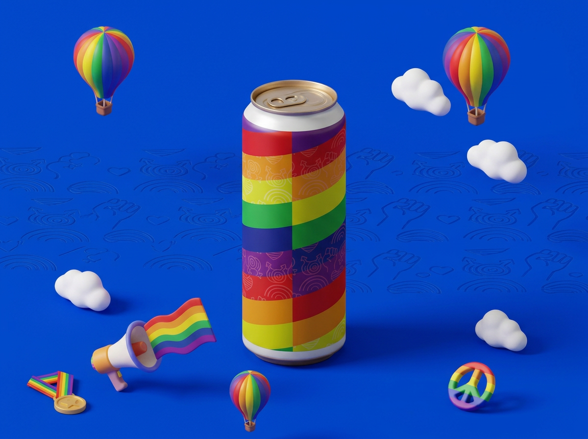
Front view